library(dplyr)
library(tibble)
library(tidyr)
library(lubridate)
library(ggplot2)
library(patchwork)
library(here)

load(file = here('data/datprc.RData'))
load(file = here('data/tiddat.RData'))

# chl data station 30
chldat <- datprc %>%
  filter(station == 30) %>%
  filter(param == 'chl')

# subset tidal data by date range in chldat
tiddat <- tiddat %>%
  filter(date >= min(chldat$date) & date <= max(chldat$date))

# year groups
delim <- 3
delims <- unique(year(tiddat$date)) %>%
  as.numeric %>%
  range %>%
  {seq(.[1], .[2], length.out = delim + 1)} %>%
  round(0)

# add temporal groupings to chldat
# add temporal groupings to chldat
chldat <- chldat %>%
  mutate(
    doy = yday(date - 31),
    yr = ifelse(mo == 'Jan', yr - 1, yr),
    yrgrp = cut(yr, breaks = delims, include.lowest = T, right = F, dig.lab = 4),
    qrt = quarter(date, fiscal_start = 2),
    qrt = factor(qrt, levels = c('1', '2', '3', '4'), labels = c('FMA', 'MJJ', 'ASO', 'NDJ'))
  ) %>%
filter(yr > 1977)Exploratory analysis of sampling effect on trend estimates in South Bay, Pt 2
Overview
This document evaluates the effect of down-sampling a long-term chlorophyll time series at station 30 in South Bay of the San Francisco Estuary. The methods herein build upon those in the previous analysis of sampling effects described here. The goal is to create a “large” number of down-sampled datasets to assess the effect on chlorophyll variation given that varying effort has occurred throughout the time series. This differs from the previous analysis in two ways:
- The previous analysis only evaluated five random down-sampled subsets, here we evaluate 1000.
- The previous analysis evaluated changes in trend estimates as the the maximum chlorophyll peak using methods in the wqtrends package, here we only evaluate changes in chlorophyll variance.
- Only the down-sampling that evaluates equal effort between all months and years is used. The previous analysis also evaluated equal sampling between year groups, where effort still varied between month.
Methods
First, the required packages are loaded, the data are imported, and chlorophyll at station 30 is filtered. The data are also subset to the date ranges in the tidal data and additional date columns are created.
The down-sampling function is created for equal effort between months.
downsamp_fun1 <- function(datin){

  tosmp <- datin %>%
    group_by(mo, yrgrp) %>%
    summarise(
      cnt = n(),
      .groups = 'drop'
    ) %>%
    group_by(mo) %>%
    filter(cnt == min(cnt)) %>%
    ungroup() %>%
    select(-yrgrp)

  minmo <- min(tosmp$cnt)

  out <- datin %>%
    group_by(yrgrp, mo) %>%
    sample_n(size = minmo) %>%
    ungroup()

  return(out)

}
The down-sampled datasets are created, taking 1000 random datasets.
rnds <- paste('Equal month', 1:1000)

# get max seasonal estimates from random down-sampled data
ests <- tibble(chlsmp = rnds) %>%
  group_by(chlsmp) %>%
  nest() %>%
  mutate(
    data = list(chldat),
    data = purrr::map(data, downsamp_fun1)
  )
A plot of sample effort for the original dataset and one of the down-sampled datasets can be compared to illustrate the difference. First, the plot function is created.
smpeff_plo <- function(datin){

  toplo <- datin

  p1 <- ggplot(toplo, aes(x = mo, group = yrgrp, fill = yrgrp)) +
    geom_bar(position = position_dodge(), color = 'black', alpha = 0.7) +
    theme_minimal() +
    labs(
      fill = 'Year group',
      x = NULL ,
      y = 'Observations'
    )

  p2 <- ggplot(toplo, aes(x = qrt, group = yrgrp, fill = yrgrp)) +
    geom_bar(position = position_dodge(), color = 'black', alpha = 0.7) +
    theme_minimal() +
    labs(
      fill = 'Year group',
      x = NULL ,
      y = 'Observations'
    )

  p <- p1 + p2 + plot_layout(ncol = 1, guides = 'collect')

  return(p)

}
Plot of sample effort for the original dataset:
smpeff_plo(chldat)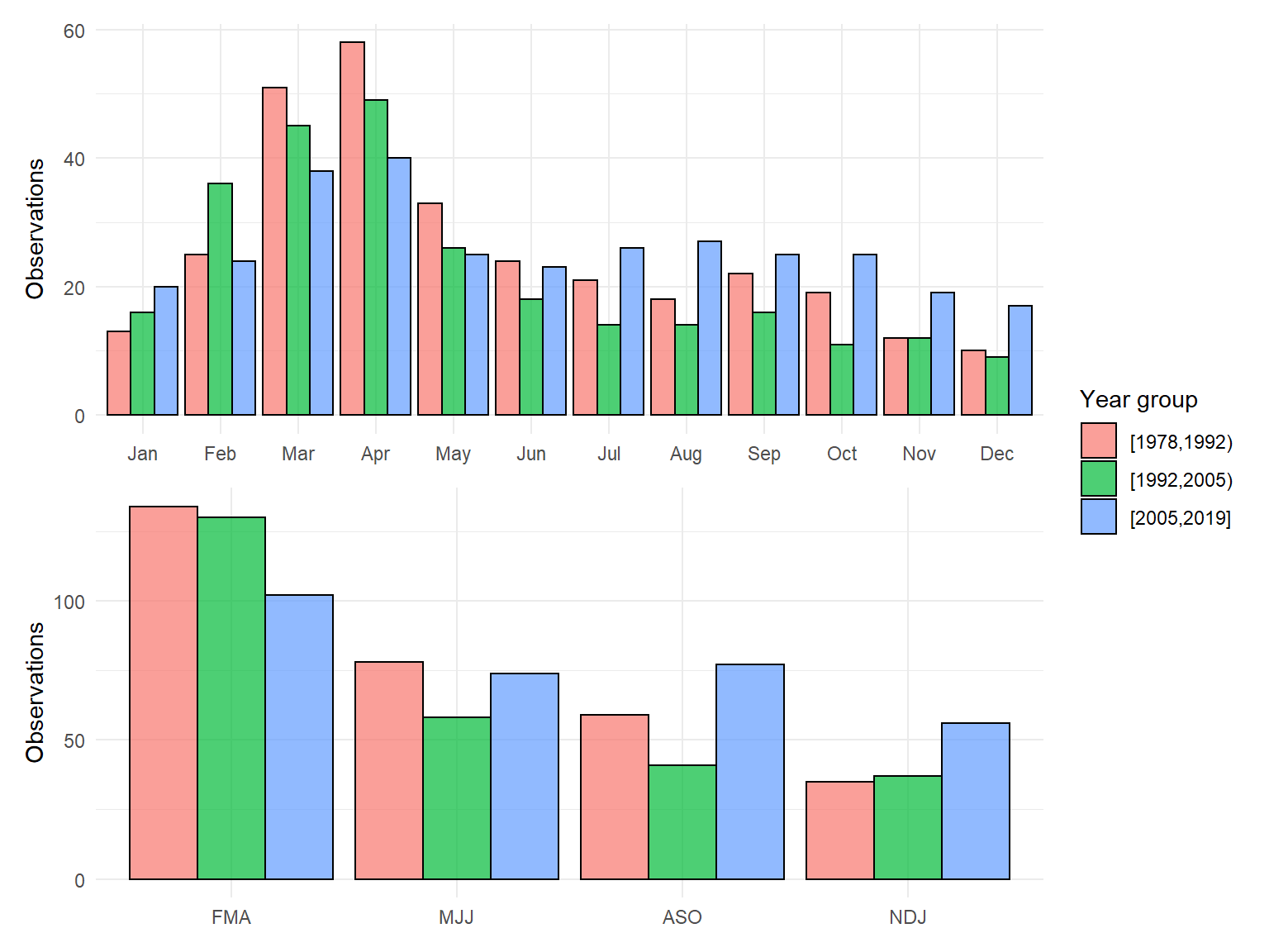
Plot of sample effort for one of the down-sampled datasets:
smpeff_plo(ests$data[[1]])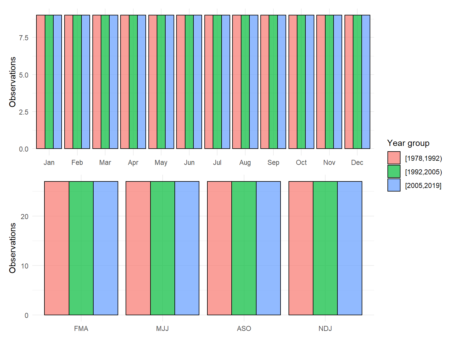
For each down-sampled dataset, the variance of chlorophyll in each year is estimated. The median variance and the 5th/95th percentiles are then estimated across all down-sampled datasets for each year.
dwnest <- ests %>%
  mutate(
    data = purrr::map(data, function(x){
      x %>%
        group_by(yr) %>%
        summarise(varchl = var(value, na.rm = T))
    })
  ) %>%
  unnest('data') %>%
  group_by(yr) %>%
  summarise(
    medvar = median(varchl, na.rm = T),
    loest = quantile(varchl, probs = 0.05, na.rm = T),
    hiest = quantile(varchl, probs = 0.95, na.rm = T)
  )
head(dwnest)
# A tibble: 6 x 4
yr medvar loest hiest
<dbl> <dbl> <dbl> <dbl>
1 1978 0.78 0.152 8.77
2 1979 7.59 0.164 127.
3 1980 2.36 0.179 176.
4 1981 12.7 0.125 22.2
5 1982 69.4 12.5 210.
6 1983 104. 6.80 296. The same is done for the actual dataset for comparison.
actest <- chldat %>%
  group_by(yr) %>%
  summarise(varchl = var(value, na.rm = T))
head(actest)
# A tibble: 6 x 2
yr varchl
<dbl> <dbl>
1 1978 3.94
2 1979 45.0
3 1980 68.0
4 1981 16.0
5 1982 111.
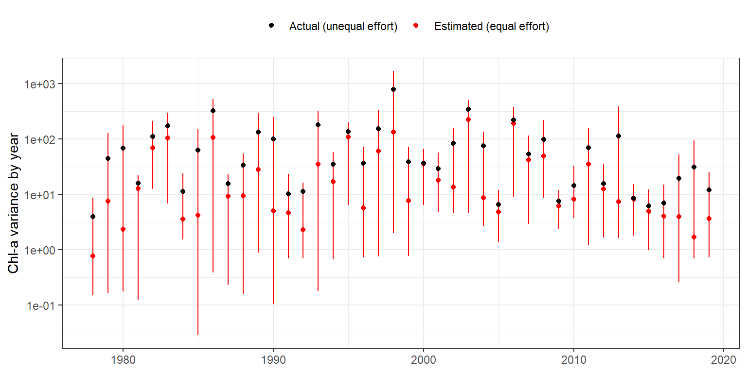
6 1983 173. Then the two can be compared to see how chlorophyll could potentially vary depending on sample design, i.e., what is the estimated variance considering equal sample effort across the time series relative to the actual variance with unequal sampling across the time series.
ggplot(dwnest, aes(x = yr, y = medvar, group = yr)) +
  geom_point(aes(col = 'Estimated (equal effort)')) +
  geom_errorbar(aes(ymin = loest, ymax = hiest, col = 'Estimated (equal effort)'), width = 0) +
  geom_point(data = actest, aes(y = varchl, col = 'Actual (unequal effort)')) +
  scale_color_manual(values = c('black', 'red')) +
  scale_y_log10() +
  guides(linetype = guide_legend(override.aes = list(linetype = 0)),
         color = guide_legend(override.aes = list(linetype = 0))) +
  theme_bw() +
  theme(
    legend.position = 'top'
  ) +
  labs(
    x = NULL,
    y = 'Chl-a variance by year',
    color = NULL
  )
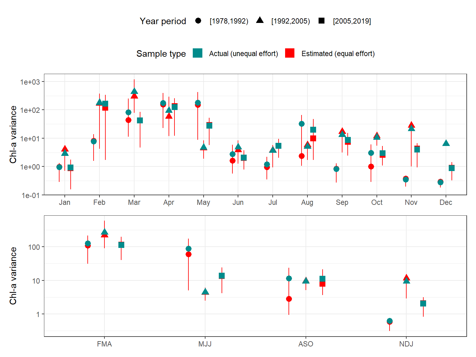
The same summaries are shown below, but grouped by month, quarter, and season for different annual periods.
# summarize down-sampled variance by month, quarter, season
dwnest <- ests %>%
  mutate(
    datamo = purrr::map(data, function(x){
      x %>%
        group_by(yrgrp, mo) %>%
        summarise(varchl = var(value, na.rm = T), .groups = 'drop')
    }),
    dataqrt = purrr::map(data, function(x){
      x %>%
        group_by(yrgrp, qrt) %>%
        summarise(varchl = var(value, na.rm = T), .groups = 'drop')
    })
  )

# get variance ranges across sub-samples for month, quarter, season
dwnmo <- dwnest %>%
  select(chlsmp, datamo) %>%
  unnest('datamo') %>%
  group_by(yrgrp, mo) %>%
  summarise(
    medvar = median(varchl, na.rm = T),
    loest = quantile(varchl, probs = 0.05, na.rm = T),
    hiest = quantile(varchl, probs = 0.95, na.rm = T),
    .groups = 'drop'
  )
dwnqrt <- dwnest %>%
  select(chlsmp, dataqrt) %>%
  unnest('dataqrt') %>%
  group_by(yrgrp, qrt) %>%
  summarise(
    medvar = median(varchl, na.rm = T),
    loest = quantile(varchl, probs = 0.05, na.rm = T),
    hiest = quantile(varchl, probs = 0.95, na.rm = T),
    .groups = 'drop'
  )

# get the actual variance for month, quarter
actmo <- chldat %>%
  group_by(yrgrp, mo) %>%
  summarise(
    medvar = var(value, na.rm = T),
    .groups = 'drop'
  )
actqrt <- chldat %>%
  group_by(yrgrp, qrt) %>%
  summarise(
    medvar = var(value, na.rm = T),
    .groups = 'drop'
  )

ddg <- position_dodge(width = 0.5)
# create the plot
p1 <- ggplot(dwnmo, aes(x = mo, y = medvar, group = yrgrp)) +
  geom_point(aes(col = 'Estimated (equal effort)', shape = yrgrp), position = ddg, size = 3) +
  geom_errorbar(aes(ymin = loest, ymax = hiest, col = 'Estimated (equal effort)'), width = 0, position = ddg) +
  geom_point(data = actmo, aes(y = medvar, col = 'Actual (unequal effort)', shape = yrgrp), position = ddg, size = 3) +
  scale_color_manual(values = c('cyan4', 'red')) +
  scale_y_log10() +
  guides(linetype = guide_legend(override.aes = list(linetype = 0, shape = 15, size = 5)),
         color = guide_legend(override.aes = list(linetype = 0, shape = 15, size = 5))) +
  labs(
    x = NULL,
    y = 'Chl-a variance',
    color = 'Sample type',
    shape = 'Year period'
  )

p2 <- ggplot(dwnqrt, aes(x = qrt, y = medvar, group = yrgrp)) +
  geom_point(aes(col = 'Estimated (equal effort)', shape = yrgrp), position = ddg,
             size = 3) +
  geom_errorbar(aes(ymin = loest, ymax = hiest, col = 'Estimated (equal effort)'), width = 0, position = ddg) +
  geom_point(data = actqrt, aes(y = medvar, col = 'Actual (unequal effort)', group = yrgrp, shape = yrgrp), position = ddg, size = 3) +
  scale_color_manual(values = c('cyan4', 'red')) +
  scale_y_log10() +
  guides(linetype = guide_legend(override.aes = list(linetype = 0, shape = 15, size = 5)),
         color = guide_legend(override.aes = list(linetype = 0, shape = 15, size = 5))) +
  labs(
    x = NULL,
    y = 'Chl-a variance',
    color = 'Sample type',
    shape = 'Year period'
  )

p1 + p2 + plot_layout(ncol = 1, guides = 'collect') &
  theme_bw() +
  theme(
    legend.position = 'top',
    legend.box = 'vertical'
  )