Understanding metabolism
Get the lesson R script: understanding.R
Get the lesson data: download zip
Lesson Outline
Lesson Exercises
Goals and Motivation
This lesson will teach you how to begin evaluating estuary metabolism estimates using data available in SWMP. Our goals are to understand the tools that are available in R, and the tidyverse in particular, to combine and explore relationships among variables that could influence metabolism. These tools are the building blocks of more detailed analyses that will help you understand site-specific relationships or to develop more comprehensive comparisons between reserves.
By the end of this lesson, you should know how or be able to find resources to do the following:
- Summarize metabolism data using dplyr
- Make some basic plots of metabolism using ggplot2
- Combine metabolism estimates with additional SWMP data using dplyr
- Compare metabolism estimates with additional SWMP data using ggplot2
Summarizing and plotting metabolism data
The SWMPr and WtRegDO packages provide a set of easy to use functions for working with SWMP data to estimate metabolism. Our goals so far have been to demonstrate how to use the pre-existing functions to evaluate metabolism in our example datasets.
What we have not covered is how to use other tools available in R for more generic data analyses. This is obviously a huge topic that we cannot adequately cover in 90 minutes. However, our goal today is to provide you with some general building blocks for developing your own analyses. We’ll be leveraging some of the other packages in the tidyverse to accomplish this goal.
We start with our detided dissolved oxygen data from Apalachicola. Check out the detiding lesson to review how we got these data. For sake of time, you can import this detided dataset for the dry bar station:
load(url('https://tbep-tech.github.io/ecometab-r-training/data/apadtd.RData'))
head(apadtd)
## DateTimeStamp Temp Sal DO_obs ATemp BP WSpd Tide metab_date
## 1 2017-01-01 00:00:00 15.9 22.1 9.0 15.7 1020 4.8 1.88 2016-12-31
## 2 2017-01-01 01:00:00 15.9 22.1 9.0 16.9 1019 5.3 1.90 2016-12-31
## 3 2017-01-01 02:00:00 15.9 22.2 9.0 18.3 1018 3.9 1.94 2016-12-31
## 4 2017-01-01 03:00:00 16.0 23.4 8.6 19.0 1018 4.6 2.00 2016-12-31
## 5 2017-01-01 04:00:00 16.0 23.5 8.5 19.5 1018 5.0 2.01 2016-12-31
## 6 2017-01-01 05:00:00 16.1 23.6 8.4 19.4 1018 4.2 2.01 2016-12-31
## solar_period solar_time day_hrs dec_time hour Beta2
## 1 sunset 2016-12-31 22:51:56 10.27807 -365.0000 0 -0.661774387
## 2 sunset 2016-12-31 22:51:56 10.27807 -364.9583 1 -0.197013200
## 3 sunset 2016-12-31 22:51:56 10.27807 -364.9167 2 0.035692964
## 4 sunset 2016-12-31 22:51:56 10.27807 -364.8750 3 -0.002937492
## 5 sunset 2016-12-31 22:51:56 10.27807 -364.8333 4 -0.187566704
## 6 sunset 2016-12-31 22:51:56 10.27807 -364.7917 5 -0.406850558
## DO_prd DO_nrm
## 1 8.821057 8.953471
## 2 8.714655 8.760363
## 3 8.657867 8.653582
## 4 8.625646 8.635960
## 5 8.583420 8.655840
## 6 8.534384 8.677753For this exercise, we’ll assume the detided data is appropriate for estimating metabolism. Remember, in practice you’ll want to check out the data with evalcor and evaluate the metabolism results with meteval. The rules at the end of the Odum lesson describe a workflow for evaluating detiding.
We estimate metabolism as follows, using the detided dissolved oxygen data:
tz <- attr(apadtd$DateTimeStamp, which = 'tzone')
lat <- 29.6747
long <- -85.0583

apaeco <- WtRegDO::ecometab(apadtd, DO_var = "DO_nrm", tz = tz, lat = lat, long = long)
head(apaeco)
## Date Pg Rt NEM
## 2016-12-31 2016-12-31 NA NA NA
## 2017-01-01 2017-01-01 37.24182 -61.00250 -23.760676
## 2017-01-02 2017-01-02 25.11674 -54.98618 -29.869439
## 2017-01-03 2017-01-03 27.53471 -32.50418 -4.969470
## 2017-01-04 2017-01-04 33.89419 -28.49020 5.403988
## 2017-01-05 2017-01-05 27.90777 -15.80833 12.099438The WtRegDO package has a plotting function that lets you view the metabolism results. This function lets you view the daily estimates of metabolism or as aggregated summaries of the daily results. For follow-up analysis, it will be useful to understand how to plot the data using more general plotting functions. This will allow you to conduct your own analyses outside of the “pre-packaged” summaries in WtRegDO.
For plotting, we can use the ggplot2 library. This comes with the tidyverse, so no need to install it separately, but you’ll of course need to load the library.
library(ggplot2)With ggplot2, you begin a plot with the function ggplot(). This creates a plotting coordinate system that you can add layers to. The first argument of ggplot() is the dataset to use in the graph. So, ggplot(data = apaeco) creates an empty base graph.
ggplot(data = apaeco)The next step is to “map” variables in your dataset to the visual properties or “aesthetics” in the plot (i.e., x variable, y variable, etc.). The mapping argument is defined with aes(), and the x and y arguments of aes() specify which variables to map to the x and y axes. The function looks for the mapped variables in the data argument, in this case, apaeco.
ggplot(data = apaeco, aes(x = Date, y = Pg))Now we need to add a “geometry” or geom to the plot to add components for viewing. We can add one or more layers (aka geoms) to ggplot(). The function geom_point() adds a layer of points to your plot based on the variable mappings in the aes function.
ggplot(data = apaeco, aes(x = Date, y = Pg)) +
  geom_point()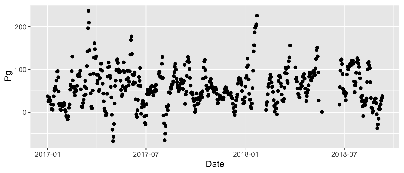
We can also overlay a line using geom_line(). Note that for geom_point() and geom_line(), we do not need to supply any arguments directly in these functions because of how we’ve setup the mapping for the initial ggplot function.
ggplot(data = apaeco, aes(x = Date, y = Pg)) +
  geom_point() +
  geom_line()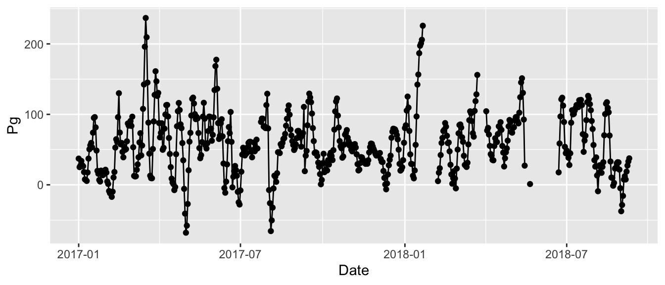
Those are the basics of ggplot. This structure may seem weird at first, but it’s design is purposeful and easily extendable by following a “grammar of graphics”. Just remember these requirements:
- All ggplot plots start with the
ggplotfunction. - The
ggplotfunction will need two pieces of information: the data and how the data are mapped to the plot aesthetics.
- Create a visual component on the plot using a geom layer after the mapping is setup.
You can find more information about ggplot2 here.
Now that we know how to create a basic plot, maybe we want to summarize the data to more easily visualize trends. The daily data are a bit messy, so maybe we want to aggregate to averages before plotting to make the trends a little more apparent. We need to use a few functions from the lubridate and dplyr packages to do this. As before, these come with the tidyverse package.
The lubridate package provides a set of functions to quickly modify date and time objects in R. It provides many functions to convert R vectors to date objects (e.g., a character string of dates imported from a csv) and many functions to extract components of date objects (e.g., month, day, etc.). The latter is extremely useful for analysis if, for example, we want to summarize or group data by specific components of time.
The dplyr package includes many functions for “wrangling” data as a common component of the workflow for evaluating data. It includes functions for selecting, modifying, grouping, summarizing, and joining datasets. All of the functions in dplyr are named as “verbs” that describe what they do. We can use lubridate in combination with dplyr to summarize the metabolism results by different time periods.
First we load the lubridate and dplyr packages. Then we use both to create a month column from our existing date column in the apaeco data set. The mutate function from dplyr adds a column to our dataset and the month function extracts the month from the existing date column. Note that the existing date column must be formatted as a date object in R for lubridate to work (check class(apaeco$Date)). The functions in SWMPr and WtRegDO should output the date column in the appropriate format.
library(lubridate)
library(dplyr)

apasum <- mutate(apaeco, mo = month(Date))
head(apasum)
## Date Pg Rt NEM mo
## 2016-12-31 2016-12-31 NA NA NA 12
## 2017-01-01 2017-01-01 37.24182 -61.00250 -23.760676 1
## 2017-01-02 2017-01-02 25.11674 -54.98618 -29.869439 1
## 2017-01-03 2017-01-03 27.53471 -32.50418 -4.969470 1
## 2017-01-04 2017-01-04 33.89419 -28.49020 5.403988 1
## 2017-01-05 2017-01-05 27.90777 -15.80833 12.099438 1We can plot the monthly values as boxplots with ggplot using the geom_boxplot geometry. The ggplot setup is the same as before, except we add a group aesthetic so it knows to group by the month values and we use a different geom. We need to use the group argument here so ggplot knows that the months are categories and not continuous values.
ggplot(apasum, aes(x = mo, y = Pg, group = mo)) +
  geom_boxplot()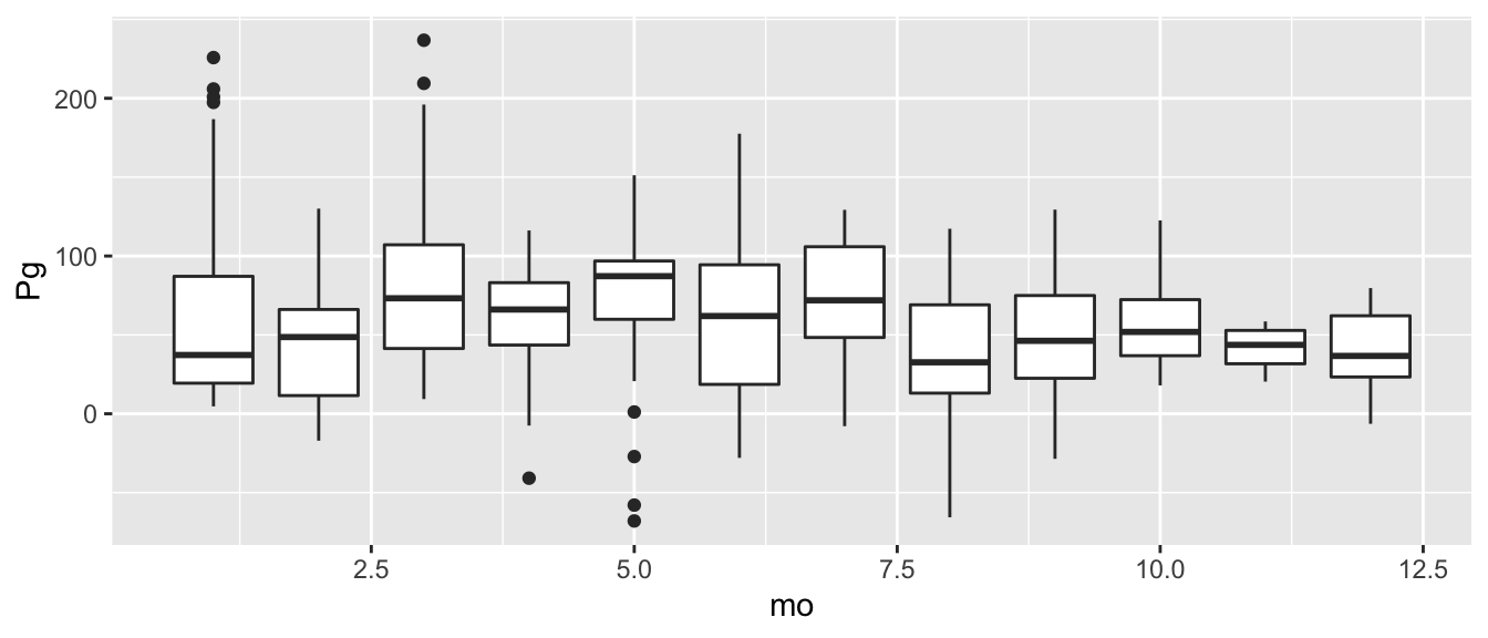
Or, if we want to summarize the raw data, we can use the dplyr group_by() and summarise() functions. Here we are grouping the data by month, then taking the average production values. Note the use of na.rm = T in the mean function.
apasum <- group_by(apasum, mo)
apasum <- summarise(apasum, meanpg = mean(Pg, na.rm = T))
Then we plot as before using geom_point() and geom_line().
ggplot(apasum, aes(x = mo, y = meanpg)) +
  geom_point() +
  geom_line()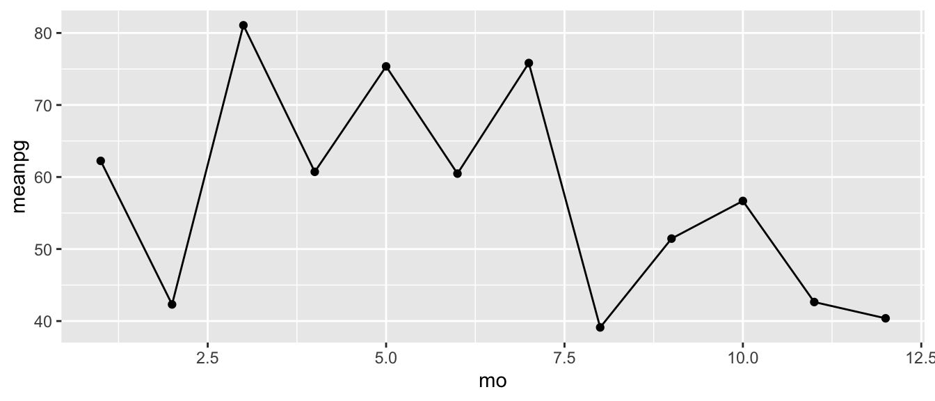
Exercise 1
Now repeat some of the above analyses using the Sapelo Island metabolism data.
Load the detided Sapelo Island data (
sapdtd) using this code:load(url('https://tbep-tech.github.io/ecometab-r-training/data/sapdtd.RData'))Estimate metabolism using the
ecometabfunction from the WtRegDO package. RunWtRegDO::ecometabusingtz = 'America/Jamaica',lat = 31.39, andlong = -81.28.Create a month variable for
sapdtdusing themutateandmonthfunctions.Group the data by month and summarize the average production using
group_byandsummarise.Plot the results with
ggplotby mapping the month and mean production columns to the x, y aesthetics and then usinggeom_point()orgeom_line()
Comparing metabolism with water quality data
One of the values of SWMP data is that we get a lot of supporting information that we can use to describe water quality changes. For metabolism, we might expect that it tracks physical drivers like temperature or light energy, or perhaps nutrient inputs. We can combine the metabolism estimates with other SWMP parameters to evaluate these hypotheses.
We can load SWMP data as before using tools from SWMPr, in particular using the import_local, qaqc, and comb functions. We’ve already done this a few times for the dry bar station at Apalachicola (see the “data prep” section in the metabolism lesson). Our detided dataset from above includes some relevant water quality and weather data that we can evaluate, but we need to wrangle the data a bit and combine it with the metabolism estimates before we can do any comparisons.
For example, perhaps we want to compare water temperature to metabolism. Since our metabolism estimates are on the daily scale, we need to summarize our water quality data at this scale to combine the two. We can use tools in the lubridate and dplyr packages to do this, just as we did above.
We can add a date column using the date function in lubridate.
# add a date column
apasum <- mutate(apadtd, Date = date(DateTimeStamp))
head(apasum)
## DateTimeStamp Temp Sal DO_obs ATemp BP WSpd Tide metab_date
## 1 2017-01-01 00:00:00 15.9 22.1 9.0 15.7 1020 4.8 1.88 2016-12-31
## 2 2017-01-01 01:00:00 15.9 22.1 9.0 16.9 1019 5.3 1.90 2016-12-31
## 3 2017-01-01 02:00:00 15.9 22.2 9.0 18.3 1018 3.9 1.94 2016-12-31
## 4 2017-01-01 03:00:00 16.0 23.4 8.6 19.0 1018 4.6 2.00 2016-12-31
## 5 2017-01-01 04:00:00 16.0 23.5 8.5 19.5 1018 5.0 2.01 2016-12-31
## 6 2017-01-01 05:00:00 16.1 23.6 8.4 19.4 1018 4.2 2.01 2016-12-31
## solar_period solar_time day_hrs dec_time hour Beta2
## 1 sunset 2016-12-31 22:51:56 10.27807 -365.0000 0 -0.661774387
## 2 sunset 2016-12-31 22:51:56 10.27807 -364.9583 1 -0.197013200
## 3 sunset 2016-12-31 22:51:56 10.27807 -364.9167 2 0.035692964
## 4 sunset 2016-12-31 22:51:56 10.27807 -364.8750 3 -0.002937492
## 5 sunset 2016-12-31 22:51:56 10.27807 -364.8333 4 -0.187566704
## 6 sunset 2016-12-31 22:51:56 10.27807 -364.7917 5 -0.406850558
## DO_prd DO_nrm Date
## 1 8.821057 8.953471 2017-01-01
## 2 8.714655 8.760363 2017-01-01
## 3 8.657867 8.653582 2017-01-01
## 4 8.625646 8.635960 2017-01-01
## 5 8.583420 8.655840 2017-01-01
## 6 8.534384 8.677753 2017-01-01Then we group by day using the group_by function from dplyr and take average water temperature using the summarise function in dplyr.
# group by date
apasum <- group_by(apasum, Date)

# summmarise average water temperature
apasum <- summarise(apasum, meantemp = mean(Temp, na.rm = T))
The last thing to do is to join these summarized data with the metabolism results. For this, we can use a “join” function from dplyr. We tell the inner_join function to combine the datasets using the Date column that is included in both the summarized water quality data and metabolism results.
# join water quality with metabolism
apasum <- inner_join(apasum, apaeco, by = 'Date')
head(apasum)
## # A tibble: 6 x 5
## Date meantemp Pg Rt NEM
## <date> <dbl> <dbl> <dbl> <dbl>
## 1 2017-01-01 16.6 37.2 -61.0 -23.8
## 2 2017-01-02 17.8 25.1 -55.0 -29.9
## 3 2017-01-03 18.9 27.5 -32.5 -4.97
## 4 2017-01-04 19 33.9 -28.5 5.40
## 5 2017-01-05 18.3 27.9 -15.8 12.1
## 6 2017-01-06 18.1 26.4 0.492 26.9Now we’re ready to plot. We can make a quick scatterplot with ggplot by mapping the appropriate variables in our dataset to the x, y aesthetics. Temperature is our independent variable in this case, so we put it on the x-axis.
p <- ggplot(data = apasum, aes(x = meantemp, y = Pg)) +
  geom_point()
p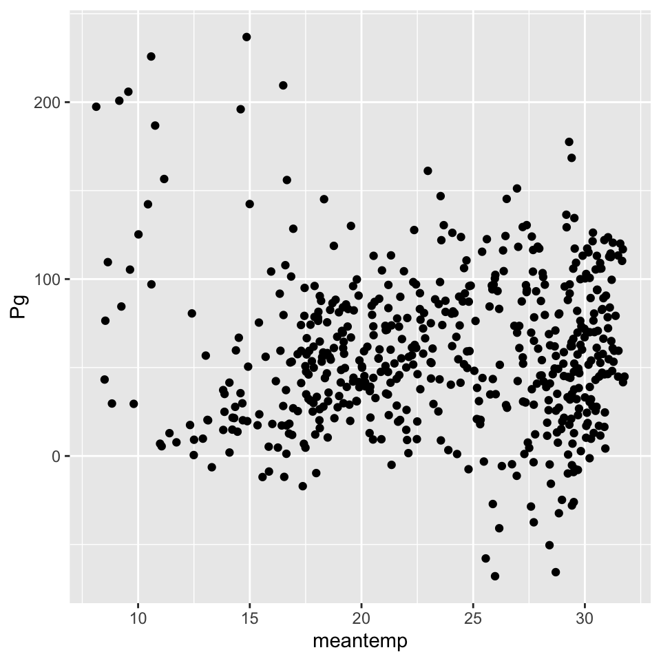
Not much there, so maybe we can want to try exploring some other relationships. We’ll do that after Exercise 2.
Exercise 2
Repeat the above examples using the Sapelo Island dataset.
First, estimate metabolism for the Sapelo Island data. You should have this already from the first exercise. Here it is again:
load(url('https://tbep-tech.github.io/ecometab-r-training/data/sapdtd.RData'))
sapeco <- WtRegDO::ecometab(sapdtd, DO_var = 'DO_nrm', lat = 31.39, long = -81.28, tz = 'America/Jamaica')
From the detided Sapelo Island dataset (
sapdtd), create a date column with themutateanddatefunctions.
Summarize mean daily water temperature using
group_byandsummarise.Join the summarized data with the metabolism data using
inner_joinandby = 'Date'.Make a scatterplot in ggplot by mapping the mean temperature and production summaries to the x, y aesthetics.
Comparing metabolism with nutrient data
Our last example showed that we couldn’t find a very strong relationship of water temperature with production. That’s okay. We had a hypothesis, checked the data, and then made a general conclusion that temperature isn’t a strong driver of production at the Apalachicola dry bar site. This doesn’t mean temperature isn’t always important - the limited data we evaluated and our coarse analysis at the daily scale provides us with some clues, but there’s much more we can evaluate.
Now we have the tools to start looking at some additional datasets. Another reasonable expectation is that metabolism may be driven by nutrients. We can use the same tools above to import, combine, and evaluate relationships of metabolism with nutrients.
Let’s import nutrient data from the dry bar station using import_local from SWMPr. The apadbnut station data are in the data folder that you downloaded for these lessons.
library(SWMPr)

apadbnut <- import_local(path = 'data', station_code = 'apadbnut')
We can use the qaqc function as before to handle the QA/QC flags.
apadbnut <- qaqc(apadbnut, qaqc_keep = c('0', '1', '2', '3', '4', '5'))
head(apadbnut)
## datetimestamp po4f nh4f no2f no3f no23f chla_n
## 1 2017-01-04 11:31:00 NA 0.008 NA NA NA 9.6
## 2 2017-02-06 11:20:00 NA 0.024 NA NA 0.140 8.8
## 3 2017-02-28 13:15:00 NA 0.016 NA NA 0.270 11.0
## 4 2017-04-11 09:12:00 0.005 0.005 NA NA 0.045 18.0
## 5 2017-05-02 10:29:00 NA 0.003 NA NA 0.033 11.0
## 6 2017-06-08 12:20:00 NA 0.022 NA NA 0.089 10.0If we want to compare any of the nutrient data to metabolism, we need to aggregate or combine the information at a time scale that allows comparison. The metabolism results are daily, but the nutrient data are collected once a month.
We can first try joining the nutrient data to metabolism by day. We have metabolism estimates for every day in our dataset, so we’re essentially taking a slice of the metabolism data that corresponds to the days when we have nutrient data. First we need to create a date column for the nutrients since the datetimestamp column shows date and time. We use mutate and date as before.
apadbnut <- mutate(apadbnut, Date = date(datetimestamp))Now we can join by date. We use inner_join from dplyr to combine by dates that are shared between the two datasets.
apajoin <- inner_join(apaeco, apadbnut, by = 'Date')
head(apajoin)
## Date Pg Rt NEM datetimestamp po4f nh4f
## 1 2017-01-04 33.89419 -28.490204 5.403988 2017-01-04 11:31:00 NA 0.008
## 2 2017-02-06 -11.80516 2.602303 -9.202854 2017-02-06 11:20:00 NA 0.024
## 3 2017-02-28 90.64424 -87.450674 3.193564 2017-02-28 13:15:00 NA 0.016
## 4 2017-04-11 96.97681 -81.417881 15.558931 2017-04-11 09:12:00 0.005 0.005
## 5 2017-05-02 -57.91229 55.285666 -2.626628 2017-05-02 10:29:00 NA 0.003
## 6 2017-06-08 69.68112 -63.644044 6.037077 2017-06-08 12:20:00 NA 0.022
## no2f no3f no23f chla_n
## 1 NA NA NA 9.6
## 2 NA NA 0.140 8.8
## 3 NA NA 0.270 11.0
## 4 NA NA 0.045 18.0
## 5 NA NA 0.033 11.0
## 6 NA NA 0.089 10.0We can now plot the metabolism estimates against the various nutrient observations. Here’s an example looking at chlorophyll.
ggplot(apajoin, aes(x = chla_n, y = Pg)) +
  geom_point()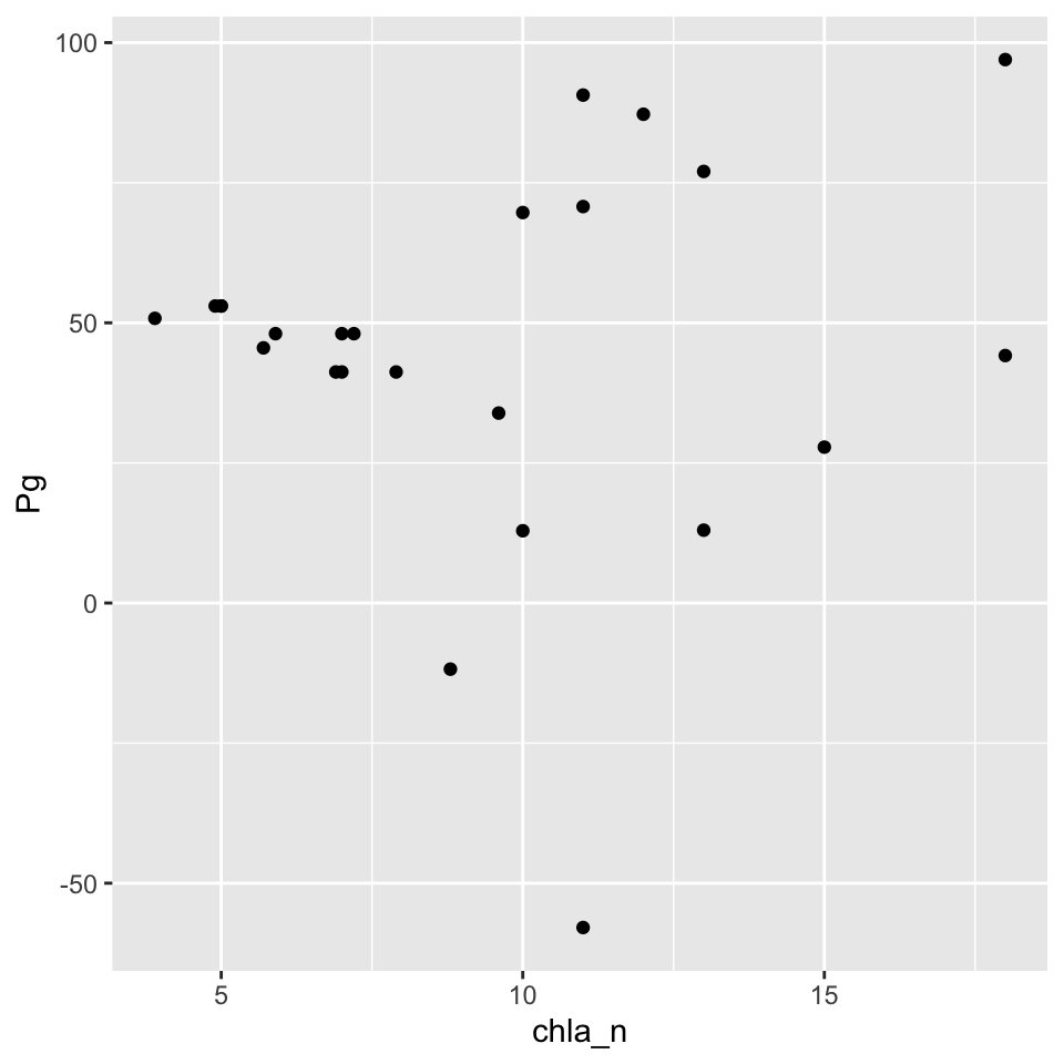
Again, not super interesting. As a final attempt at comparing these data, we can try averaging results to a common unit of time, such as month. This may reduce some of the variability in the data and also provide a more general comparison by evaluating average conditions as opposed to “instantaneous” comparisons at the daily scale.
For both the metabolism and nutrient data, we can “floor” the dates to the first of each month, group by date, then summarize average values. Although technically we’re changing the dates, we are retaining the date class in the date column which can sometimes help with plotting or other downstream analysis. We use the floor_date function from lubridate.
# floor nutrient dates
apadbnut <- mutate(apadbnut,
    dateflr = floor_date(Date, unit = 'month')
  )

# floor metabolism dates
apaeco <- mutate(apaeco,
    dateflr = floor_date(Date, unit = 'month')
  )
Then we can join by the floored dates, group by the floored dates, and summarize to averages.
# join by the floored dates
apajoin <- inner_join(apaeco, apadbnut, by = 'dateflr')

# group by and summarize
apajoin <- group_by(apajoin, dateflr)
apajoin <- summarise(apajoin,
  chla_n = mean(chla_n, na.rm = T),
  nh4f = mean(nh4f, na.rm = T),
  Pg = mean(Pg, na.rm = T),
  Rt = mean(Rt, na.rm = T),
  NEM = mean(NEM, na.rm = T)
  )
Now plot as before. Here we’re looking at average Production vs chlorophyll using the monthly summaries.
ggplot(apajoin, aes(x = chla_n, y = Pg)) +
  geom_point()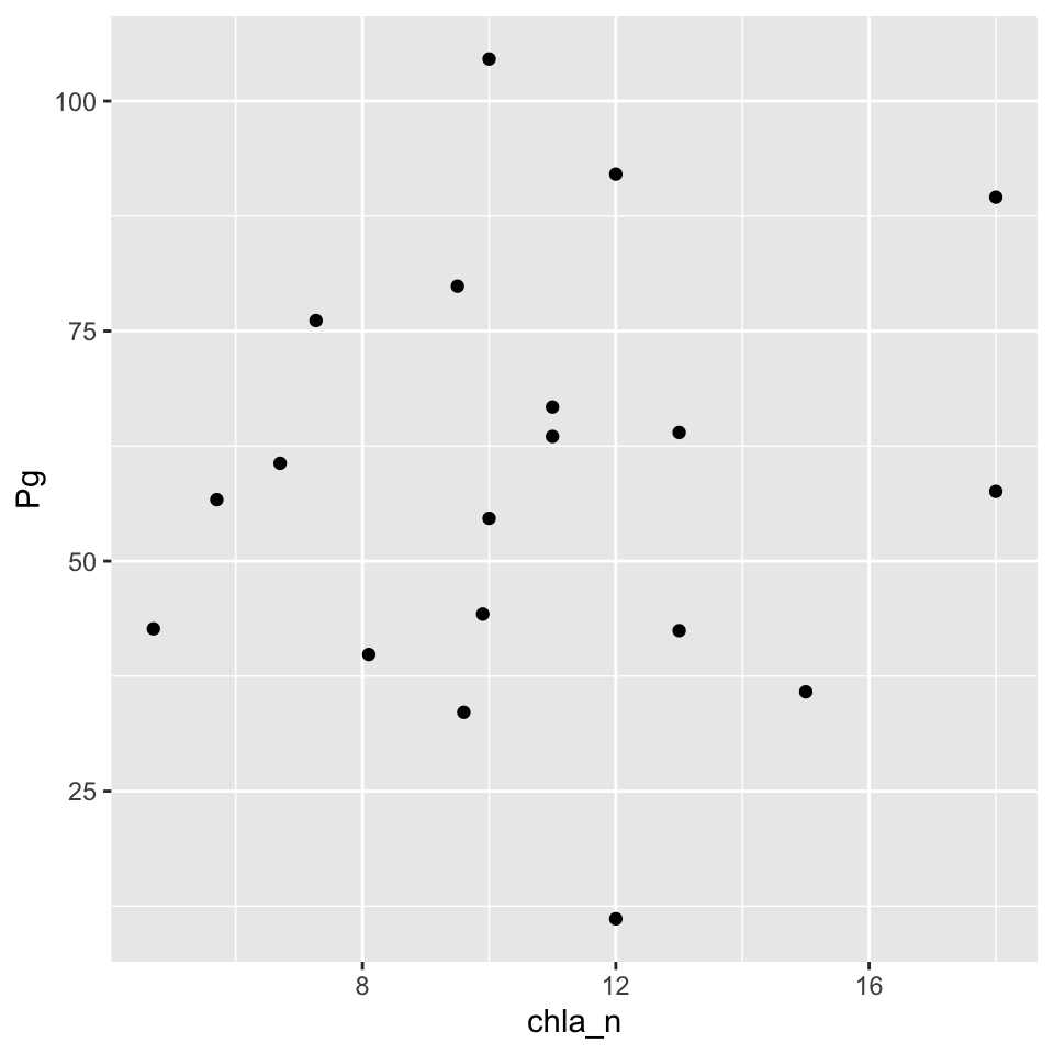
Exercise 3
Repeat the above examples using the Sapelo Island dataset.
- Import the nutrient data for the
sapdcnutstation usingimport_localandqaqc. - Add a date column to the nutrients data using
mutatefrom dplyr anddatefrom lubridate. - Floor the date columns in the nutrients data and metabolism data (
sapecofrom exercise 2) usingunit = 'month'withfloor_datefrom lubridate. - Combine the nutrients and metabolism data by the floored dates using
inner_joinandby = 'dateflr'(or whatever you named the floored date column). - Group and summarize the joined data by the floored dates using
group_byandsummarise. For the summaries, take the average of the metabolism estimates and any of the nutrient parameters of your choosing. - Make a scatterplot in ggplot by mapping the mean nutrients and mean metabolism summaries to the x, y aesthetics and using
geom_point.
Summary
In this lesson, we explored some of the tools in the tidyverse that can be used for more generic evaluations of metabolism data. Using these tools to explore differences in metabolism between reserves and how these differences are governed by other water quality or nutrient parameters will be valuable to understanding drivers of change at each site. The tools provided in SWMPr and WtRegDO are just a starting point and we encourage continued learning to make full use of the tools available in R. Checkout our Data and resources tab for additional information.