library(tidyverse)
library(here)
library(sf)
library(mapview)
library(ggspatial)5 SWFWMD examples
Get the lesson R script: swfwmd_examples.R
Get the lesson data: download zip
5.1 Lesson Outline
Now we should be at a point where we can run through a complete analysis workflow, from data import all the way to data product. In this lesson, we’ll recreate some of the plots provided in this SWFWMD report for Lake Panasoffkee. There are no exercises in this lesson, so just follow along with the examples as they’re covered.
The goal for this lesson is to learn how to conceptualize and execute a complete data analysis workflow. To do this, you will need to know where you’re starting and where you need to go, and what pieces are needed in between. The examples provided will demonstrate how to do this and will use methods from the prior lessons to develop the workflows.
First, let’s load the packages we’ll be using.
5.2 Summary plots
We’ll reproduce this figure using our water quality data.
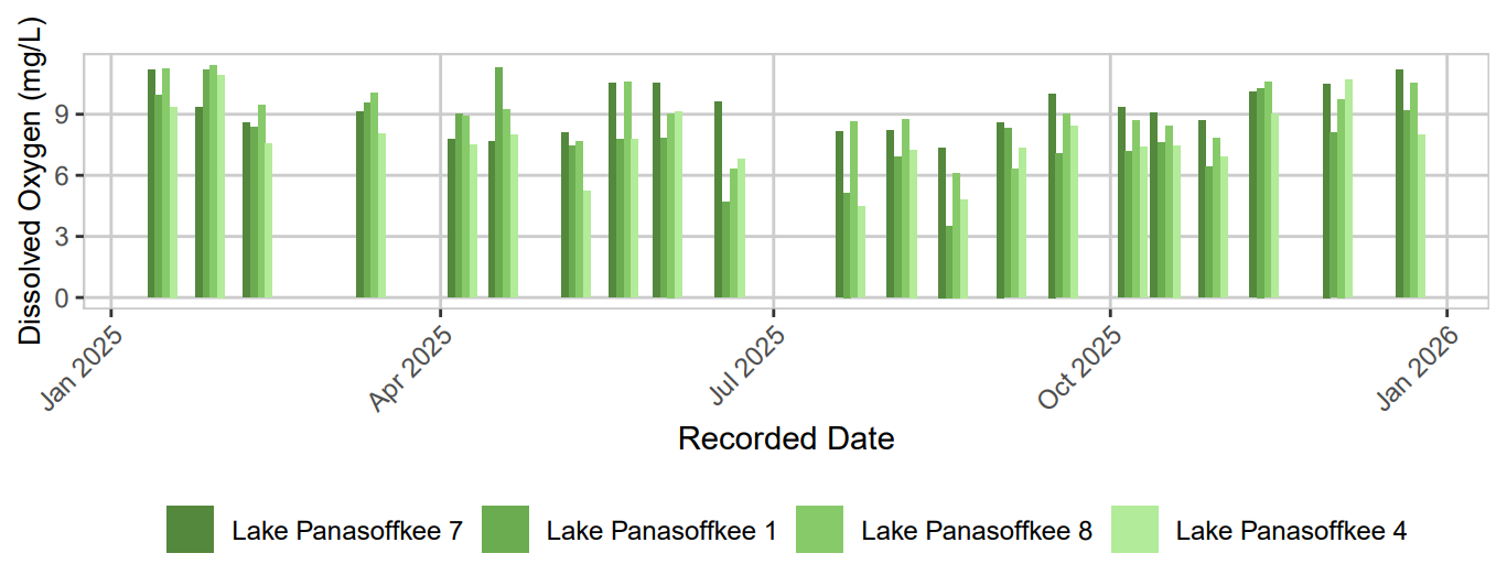
Take a moment to evaluate the figure. What does it show you? Do we have the right data to recreate it? What do we need to do to our data to plot it?
Let’s look at our water quality data. We’ll load it from the wqdat.csv file in our data folder, but you could also just retrieve it again using the URL from the first lesson.
wqdat <- read_csv(here('data', 'wqdat.csv'))
str(wqdat)
spc_tbl_ [51,931 × 7] (S3: spec_tbl_df/tbl_df/tbl/data.frame)
$ station_no : num [1:51931] 23113 23113 23113 23113 23113 ...
$ station_name : chr [1:51931] "Lake Panasoffkee 7" "Lake Panasoffkee 7" "Lake Panasoffkee 7" "Lake Panasoffkee 7" ...
$ parametertype_shortname: chr [1:51931] "WQ_79" "WQ_79" "WQ_79" "WQ_79" ...
$ parametertype_name : chr [1:51931] "Alkalinity (CaCO3)" "Alkalinity (CaCO3)" "Alkalinity (CaCO3)" "Alkalinity (CaCO3)" ...
$ timestamp : POSIXct[1:51931], format: "2000-11-08 11:30:00" "2000-11-08 11:30:00" ...
$ value : num [1:51931] 73 73 88.7 88.7 118 119 119 137 137 119 ...
$ unit_symbol : chr [1:51931] "mg/l" "mg/l" "mg/l" "mg/l" ...
- attr(*, "spec")=
.. cols(
.. station_no = col_double(),
.. station_name = col_character(),
.. parametertype_shortname = col_character(),
.. parametertype_name = col_character(),
.. timestamp = col_datetime(format = ""),
.. value = col_double(),
.. unit_symbol = col_character()
.. )
- attr(*, "problems")=<pointer: 0x560421a07ff0> There are a number of things we need to do to prepare this for plotting.
- Filter stations of interest
- Filter by parameter
- Filter by year
- Create a date column
- Convert stations to factor levels for plot order
- Summarize the parameter by station and date
Also take note of the use of dplyr::filter(), which means use filter() from the dplyr package. There’s a “namespace” conflict with a function of the same name from another loaded package, so we need to be explicit here.
# a station vector so we don't have to type out all the names
stas <- paste('Lake Panasoffkee', c(7, 1, 8, 4))

# wrangle the data
toplo <- wqdat |>
  dplyr::filter(station_name %in% stas) |>
  dplyr::filter(parametertype_name == 'Dissolved Oxygen') |>
  dplyr::filter(year(timestamp) == 2025) |>
  mutate(
    date = as.Date(timestamp),
    station_name = factor(station_name, levels = stas)
  ) |>
  summarise(
    value = mean(value, na.rm = T),
    .by = c(date, station_name)
  )

str(toplo)
tibble [88 × 3] (S3: tbl_df/tbl/data.frame)
$ date : Date[1:88], format: "2025-01-15" "2025-01-28" ...
$ station_name: Factor w/ 4 levels "Lake Panasoffkee 7",..: 1 1 1 1 1 1 1 1 1 1 ...
$ value : num [1:88] 11.18 9.32 8.6 9.13 7.76 ...Now we’re ready to plot. The final plot looks relatively simple, but there’s a number of things we need to do to replicate the styling.
- Setup the aesthetics
- “dodge” the bars by date
- Use a green color palette
- Change the overall theme
- Move the legend to the bottom and remove the title
- Angle the x-axis text
- Modify the plot grid lines
- Make nice labels
Let’s first create the initial plot.
ggplot(toplo, aes(x = date, y = value)) +
  geom_col()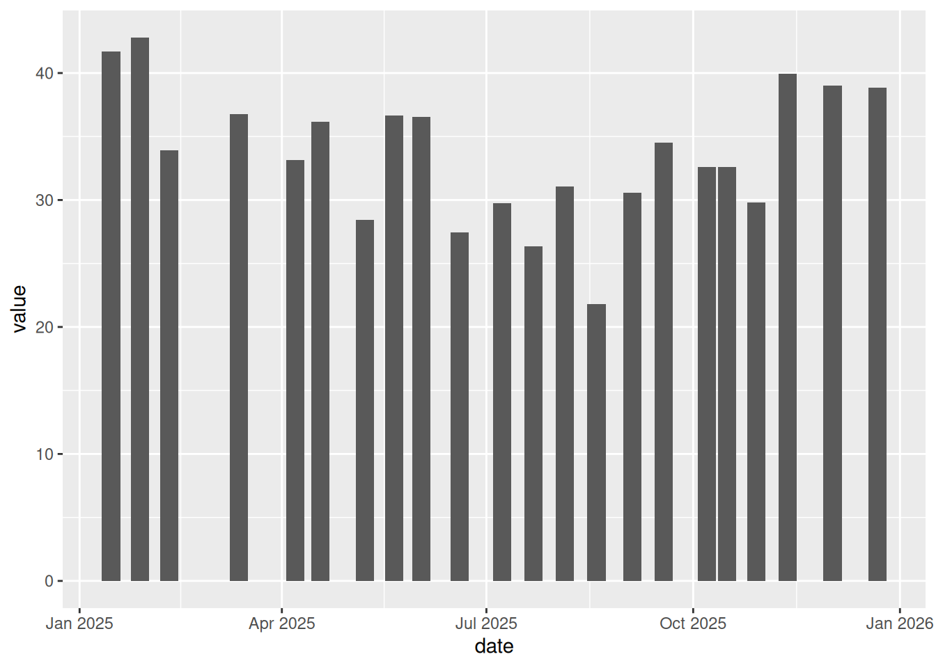
The first plot grouped all the stations together. We can use the fill aesthetic to distinguish them.
ggplot(toplo, aes(x = date, y = value, fill = station_name)) +
  geom_col()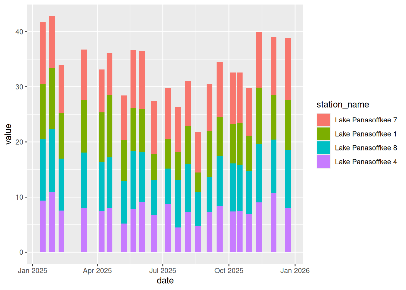
The stations are currently stacked on top of each other. We can place them next to each other for each date using the position argument in geom_col(). We’ll also add a grey color outline (you’ll see why later).
ggplot(toplo, aes(x = date, y = value, fill = station_name)) +
  geom_col(position = position_dodge(), color = 'grey')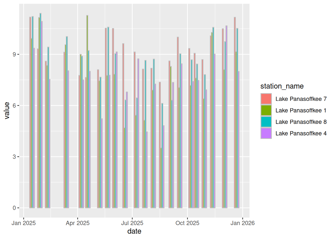
Next we can change the color using scale_fill_brewer().
ggplot(toplo, aes(x = date, y = value, fill = station_name)) +
  geom_col(position = position_dodge(), color = 'grey') +
  scale_fill_brewer(palette = 'Greens', direction = -1)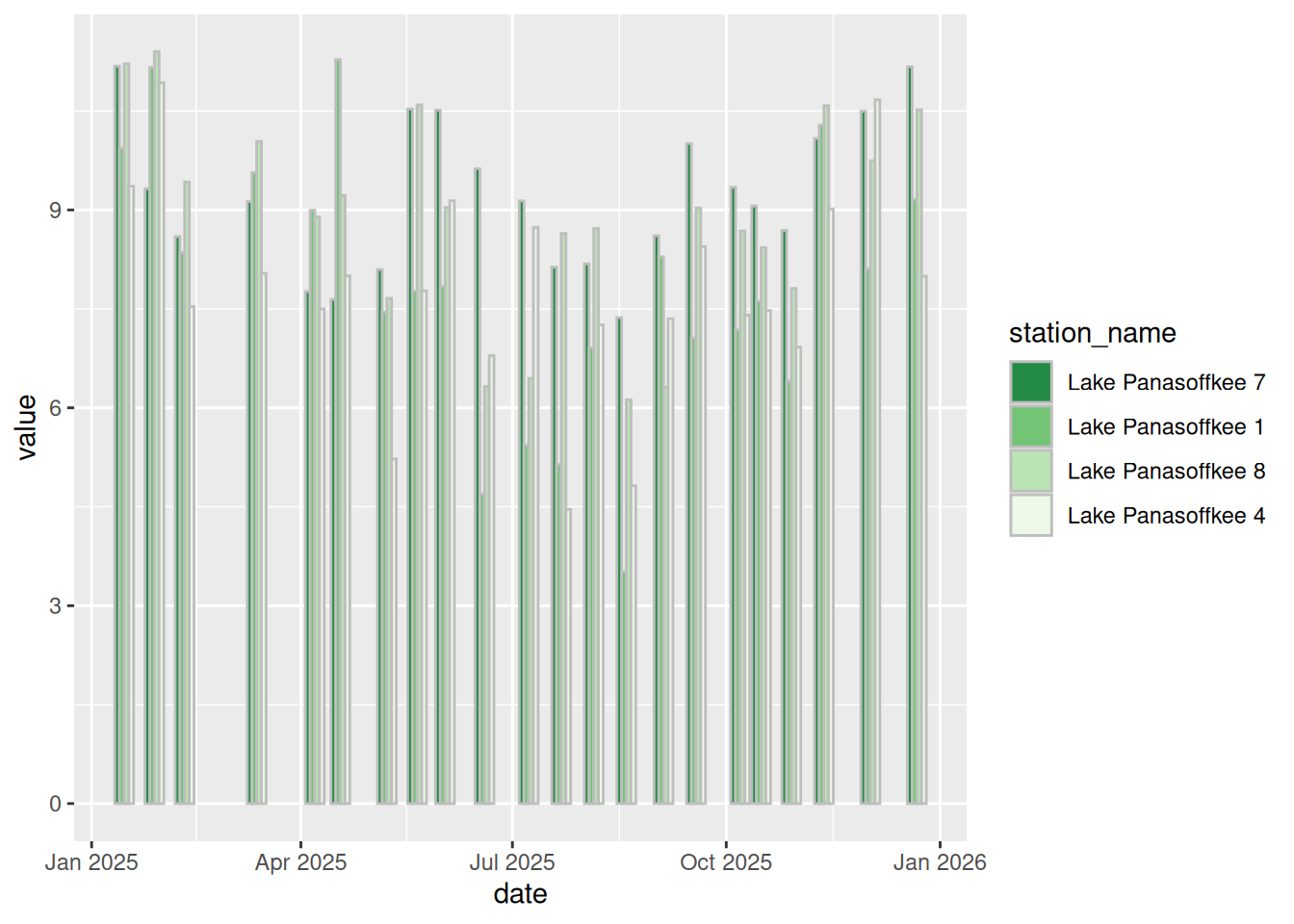
The rest is just plot aesthetics. We can globally apply the theme_bw() theme.
ggplot(toplo, aes(x = date, y = value, fill = station_name)) +
  geom_col(position = position_dodge(), color = 'grey') +
  scale_fill_brewer(palette = 'Greens', direction = -1) +
  theme_bw()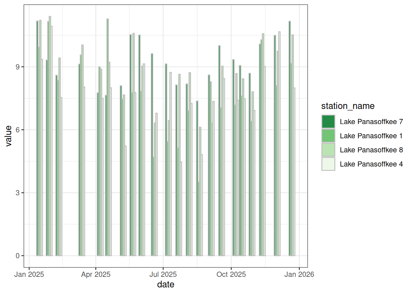
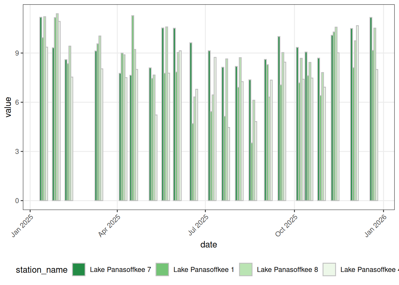
Then we can use the theme() function to modify several components: axis.text.x modifies the text on the x-axis, legend.position changes the location of the legend, and panel.grid.minor controls the “minor” gridlines.
ggplot(toplo, aes(x = date, y = value, fill = station_name)) +
  geom_col(position = position_dodge(), color = 'grey') +
  scale_fill_brewer(palette = 'Greens', direction = -1) +
  theme_bw() +
  theme(
    axis.text.x = element_text(angle = 45, hjust = 1),
    legend.position = 'bottom',
    panel.grid.minor = element_blank()
  )
Now we add our nice labels and we’re done!
ggplot(toplo, aes(x = date, y = value, fill = station_name)) +
  geom_col(position = position_dodge(), color = 'grey') +
  scale_fill_brewer(palette = 'Greens', direction = -1) +
  theme_bw() +
  theme(
    axis.text.x = element_text(angle = 45, hjust = 1),
    legend.position = 'bottom',
    panel.grid.minor = element_blank()
  ) +
  labs(
    x = 'Recorded Date',
    y = 'Dissolved Oxygen (mg/L)',
    fill = NULL
) 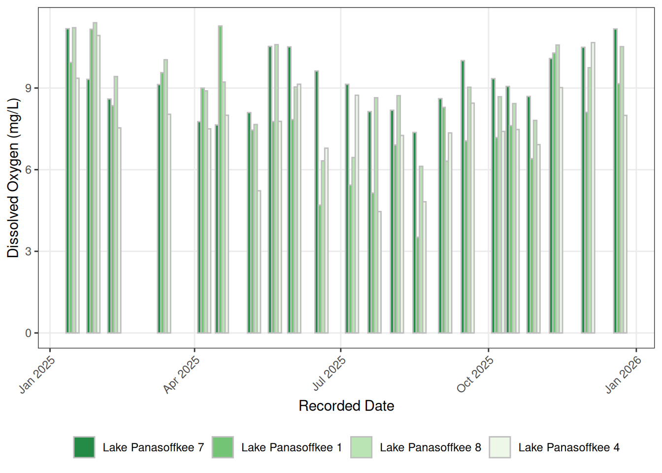
To get the width and height to match the original plot, you can save it using RStudio’s built in save feature or use any of the available graphics devices. Here we use the png() function after first assigning the plot to object p. The output should look like the figure below.
p <- ggplot(toplo, aes(x = date, y = value, fill = station_name)) +
  geom_col(position = position_dodge(), color = 'grey') +
  scale_fill_brewer(palette = 'Greens', direction = -1) +
  theme_bw() +
  theme(
    axis.text.x = element_text(angle = 45, hjust = 1),
    legend.position = 'bottom',
    panel.grid.minor = element_blank()
  ) +
  labs(
    x = 'Recorded Date',
    y = 'Dissolved Oxygen (mg/L)',
    fill = NULL
  )

png(here('figs/swfwmd_examples', 'dosummary.png'), height = 3, width = 8, units = 'in', res = 300)
print(p)
dev.off()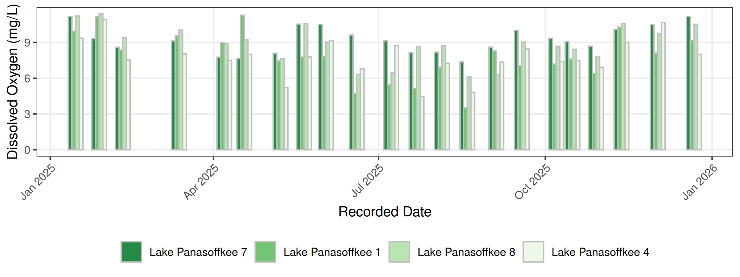
5.3 Time series plots
Next, we’ll create a plot similar to this one using our water level data from the first lesson. The stations are different in our data, but the principles are the same.
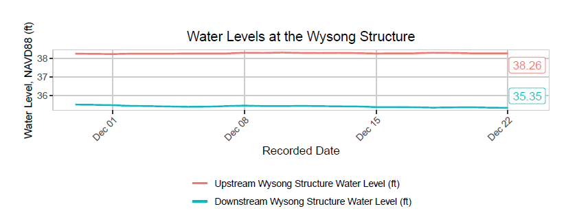
Take a moment to evaluate the figure. What does it show you? Do we have the right data to recreate it? What do we need to do to our data to plot it?
Let’s look at our water level data. This time, we have two separate files, one for each station: wldat1.csv and wldat2.csv. Each file needs quite a bit of cleanup before we can combine them.
There are a number of things we need to do to prepare these data for plotting.
- Import each station’s file and remove the header rows
- Rename the date and level columns to meaningful names
- Convert the date and level columns to the correct data types
- Join the two station datasets by date
- Filter only the most recent month
- Reshape the joined data to long format
- Create a label for each station
- Get the most recent date’s values to use for point labels
wldat1 <- read_csv(here('data', 'wldat1.csv')) |>
  slice(5:n()) |>
  rename(
    date = X.station_no,
    levelft = X1035944
  ) |>
  mutate(
    date = as.Date(date),
    levelft = as.numeric(levelft)
  )

wldat2 <- read_csv(here('data', 'wldat2.csv')) |>
  slice(5:n()) |>
  rename(
    date = X.station_no,
    levelft = X23142
  ) |>
  mutate(
    date = as.Date(date),
    levelft = as.numeric(levelft)
  )

str(wldat1)
tibble [459 × 2] (S3: tbl_df/tbl/data.frame)
$ date : Date[1:459], format: "2025-04-11" "2025-04-12" ...
$ levelft: num [1:459] 38.9 39 38.9 38.9 38.9 ...str(wldat2)tibble [7,526 × 2] (S3: tbl_df/tbl/data.frame)
$ date : Date[1:7526], format: "2005-12-05" "2005-12-06" ...
$ levelft: num [1:7526] 39.2 39.2 39.2 39.3 39.2 ...Now we can join the two station datasets by date and filter to the most recent month.
toplo <- inner_join(wldat1, wldat2, by = 'date', suffix = c('_1035944', '_23142')) |>
  dplyr::filter(date >= as.Date('2026-06-01'))
head(toplo)
# A tibble: 6 × 3
date levelft_1035944 levelft_23142
<date> <dbl> <dbl>
1 2026-06-01 37.7 37.6
2 2026-06-02 37.7 37.6
3 2026-06-03 37.7 37.6
4 2026-06-04 37.7 37.6
5 2026-06-05 37.6 37.6
6 2026-06-06 37.6 37.5Then we reshape to long format so we have a single column for water level and station and a single column for the values.
toplo <- toplo |>
  pivot_longer(-date)
head(toplo)
# A tibble: 6 × 3
date name value
<date> <chr> <dbl>
1 2026-06-01 levelft_1035944 37.7
2 2026-06-01 levelft_23142 37.6
3 2026-06-02 levelft_1035944 37.7
4 2026-06-02 levelft_23142 37.6
5 2026-06-03 levelft_1035944 37.7
6 2026-06-03 levelft_23142 37.6The name column is not tidy because it has two pieces of information in each “cell”. We can separate the name column into two with separate() so that we have the variable and station names as two different columns. Then we add “Station” to the station values so it will look nicer in the legend.
toplo <- toplo |>
  separate(name, c('var', 'station')) |>
  mutate(
    station = paste('Station', station)
  )

str(toplo)
tibble [86 × 4] (S3: tbl_df/tbl/data.frame)
$ date : Date[1:86], format: "2026-06-01" "2026-06-01" ...
$ var : chr [1:86] "levelft" "levelft" "levelft" "levelft" ...
$ station: chr [1:86] "Station 1035944" "Station 23142" "Station 1035944" "Station 23142" ...
$ value : num [1:86] 37.7 37.6 37.7 37.6 37.7 ...We also need a separate dataset with only the most recent date so we can label the lines with the current water level.
toplopts <- toplo |>
  filter(date == max(date))

toplopts
# A tibble: 2 × 4
date var station value
<date> <chr> <chr> <dbl>
1 2026-07-13 levelft Station 1035944 37.2
2 2026-07-13 levelft Station 23142 37.1Now we’re ready to plot. As before, the final plot requires several styling additions.
- Setup the aesthetics and plot the lines
- Add labels showing the most recent value for each station
- Change the overall theme
- Move the legend to the bottom and arrange it as two rows
- Angle the x-axis text
- Modify the plot grid lines
- Make nice labels
Let’s first create the initial plot with a line for each station. We’re using a different “geom” here, geom_line(), which is used to plot lines instead of bars.
ggplot(toplo, aes(x = date, y = value, color = station)) +
  geom_line()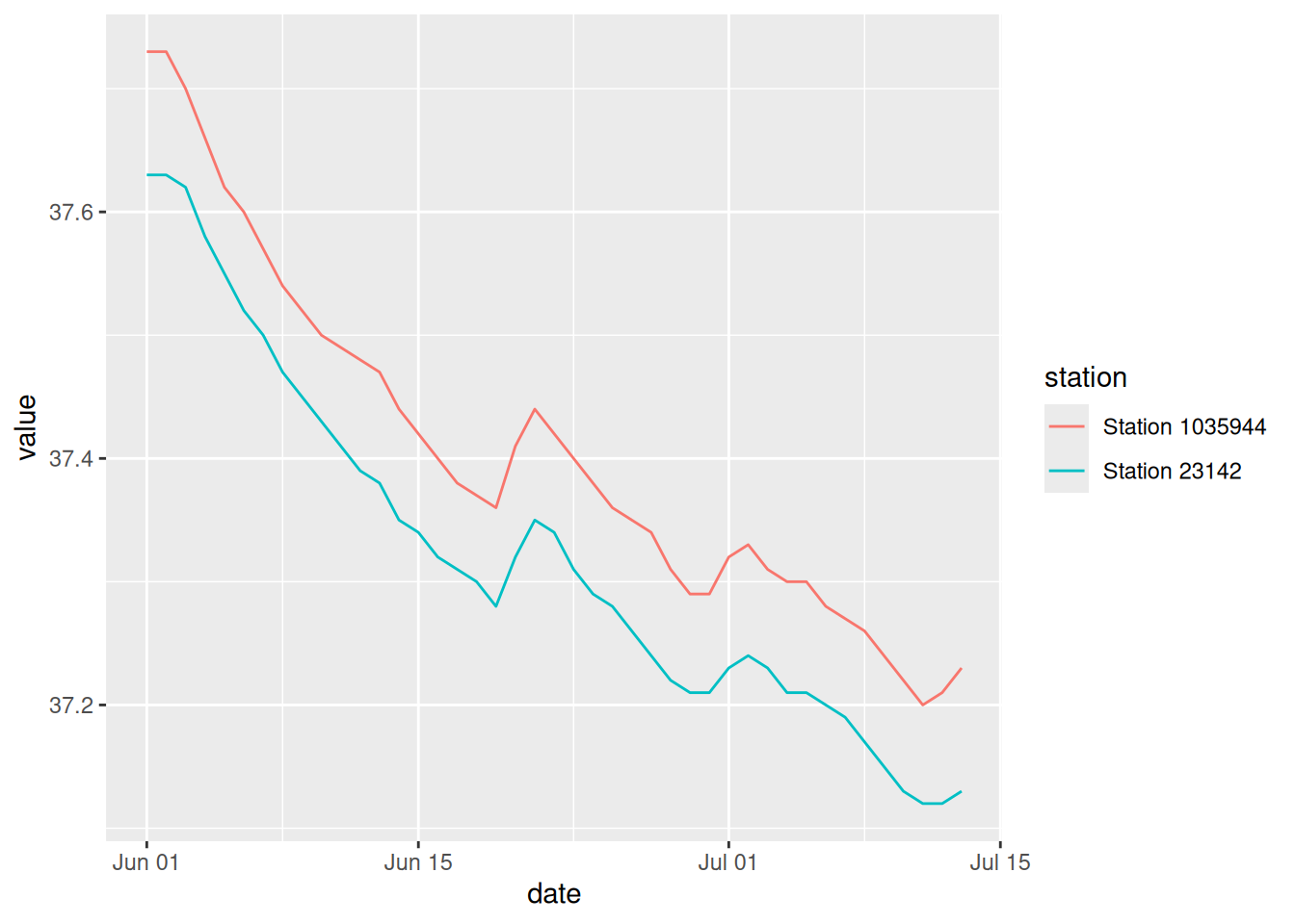
Next, we can add labels showing the most recent water level for each station, using the toplopts data we created above. We’ll have to get fancy with some of the arguments so that we can see the actual labels (there are much better ways of doing this using the ggrepel package, but we’ll keep it simple for now).
ggplot(toplo, aes(x = date, y = value, color = station)) +
  geom_line() +
  geom_label(data = toplopts, aes(label = value), hjust = "inward", vjust = "inward", show.legend = F)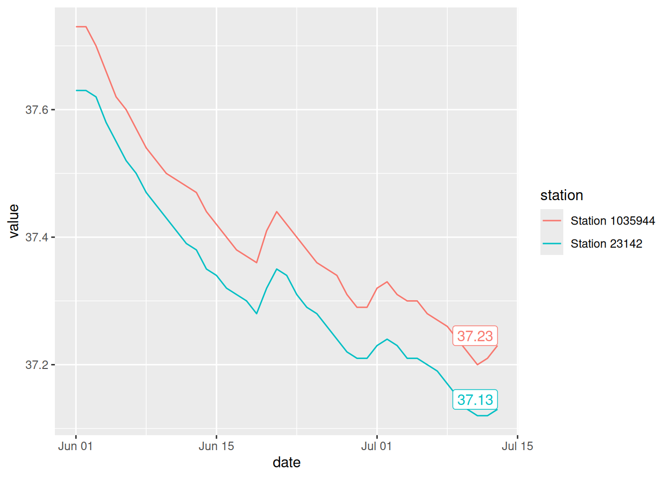
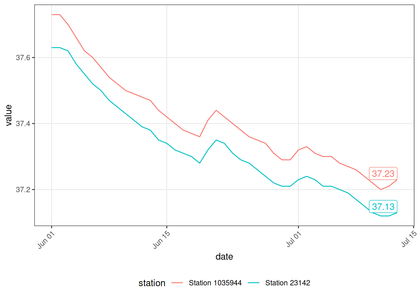
As before, we can apply theme_bw() and use theme() to angle the x-axis text, move the legend to the bottom, and remove the minor gridlines.
ggplot(toplo, aes(x = date, y = value, color = station)) +
  geom_line() +
  geom_label(data = toplopts, aes(label = value), hjust = "inward", vjust = "inward", show.legend = F) +
  theme_bw() +
  theme(
    axis.text.x = element_text(angle = 45, hjust = 1),
    legend.position = 'bottom',
    panel.grid.minor = element_blank()
  )
We can use guides() to wrap the legend across two rows. I always have to Google this step…
ggplot(toplo, aes(x = date, y = value, color = station)) +
  geom_line() +
  geom_label(data = toplopts, aes(label = value), hjust = "inward", vjust = "inward", show.legend = F) +
  theme_bw() +
  theme(
    axis.text.x = element_text(angle = 45, hjust = 1),
    legend.position = 'bottom',
    panel.grid.minor = element_blank()
  ) +
  guides(color = guide_legend(nrow = 2, byrow = TRUE))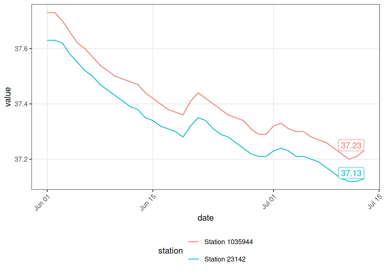
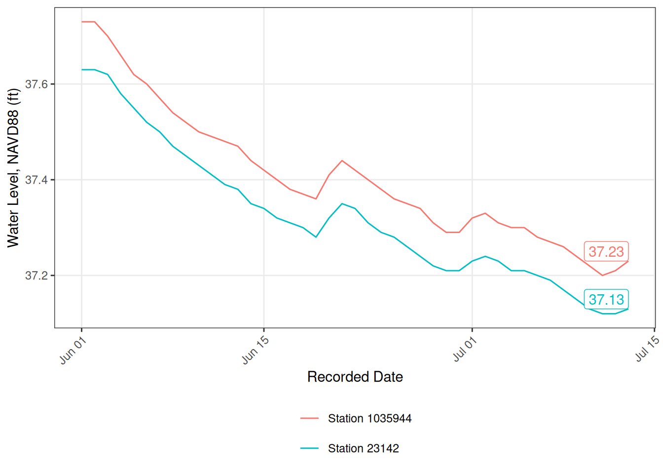
Now we add our nice labels and we’re done!
ggplot(toplo, aes(x = date, y = value, color = station)) +
  geom_line() +
  geom_label(data = toplopts, aes(label = value), hjust = "inward", vjust = "inward", show.legend = F) +
  theme_bw() +
  theme(
    axis.text.x = element_text(angle = 45, hjust = 1),
    legend.position = 'bottom',
    panel.grid.minor = element_blank()
  ) +
  guides(color = guide_legend(nrow = 2, byrow = TRUE)) +
  labs(
    x = 'Recorded Date',
    y = 'Water Level, NAVD88 (ft)',
    color = NULL
  )
We can save it using the same method as before to get the dimensions similar to the original plot.
p <- ggplot(toplo, aes(x = date, y = value, color = station)) +
  geom_line() +
  geom_label(data = toplopts, aes(label = value), hjust = "inward", vjust = "inward", show.legend = F) +
  theme_bw() +
  theme(
    axis.text.x = element_text(angle = 45, hjust = 1),
    legend.position = 'bottom',
    panel.grid.minor = element_blank()
  ) +
  guides(color = guide_legend(nrow = 2, byrow = TRUE)) +
  labs(
    x = 'Recorded Date',
    y = 'Water Level, NAVD88 (ft)',
    color = NULL
  )

png(here('figs/swfwmd_examples', 'tsplot.png'), height = 3.5, width = 8, units = 'in', res = 300)
print(p)
dev.off()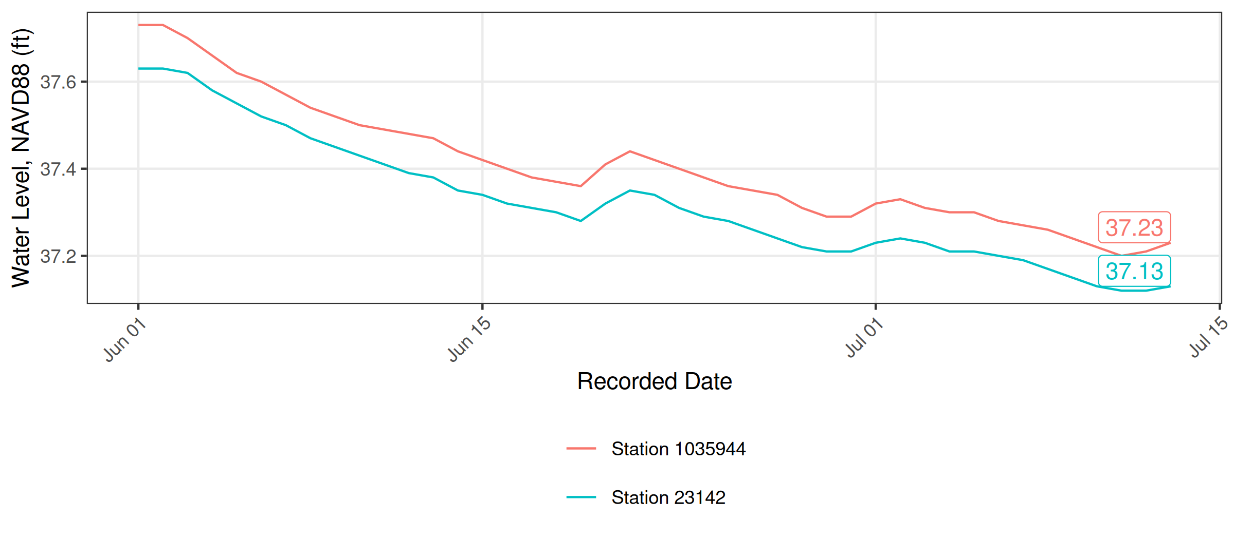
5.4 Maps
Cartography or map-making is also very doable in R. Like most applications, it takes very little time to create something simple, but much more time to create a finished product. We’ll be using the ggplot2 and the mapview packages to get you started. Both packages work “out-of-the-box” with sf data objects, described below.
Most of us are probably familiar with the basic types of spatial data and their components. We’re going to focus on vector data for this example because these data are easily conceptualized as features or discrete objects with spatial information. Raster data, by contrast, are stored in a grid with cells having assigned values. Raster data are more common for data with continuous coverage, such as climate or weather layers.
Vector data come in three flavors. The simplest is a point, which is a 0-dimensional feature that can be used to represent a specific location on the earth, such as a single monitoring station or an entire city. Linear, 1-dimensional features can be represented with points (or vertices) that are connected by a path to form a line and when many points are connected these form a polyline. Finally, when a polyline’s path returns to its origin to represent an enclosed 2-dimensional space, such as a watershed boundary, lake, or management area, this forms a polygon.
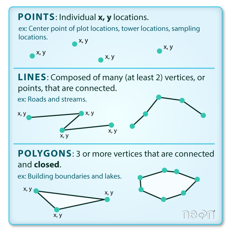
Image source
All vector data are represented similarly, whether they’re points, lines, or polygons. Points are defined by a single coordinate location, whereas a line or polygon include several points with a grouping variable that distinguishes one object from another. In all cases, the aggregate dataset is composed of one or more features of the same type (points, lines, or polygons).
There are two other pieces of information that are included with vector data. The attributes that can be associated with each feature and the coordinate reference system or CRS. The attributes can be any supporting information about a feature, such as a text description or summary data. You can identify attributes as anything in a spatial dataset that is not explicitly used to define the location (or geometry) of the features.
The CRS is used to establish a frame of reference for the locations in your spatial data. The chosen CRS ensures that all features are correctly referenced relative to each other, especially between different datasets. As a simple example, imagine comparing length measurements for two objects where one was measured in centimeters and another in inches. If you didn’t know the unit of measurement, you could not compare relative lengths. The CRS is similar in that it establishes a common frame of reference, but for spatial data. An added complication with spatial data is that location can be represented in both 2-dimensional or 3-dimensional space. This is beyond the scope of this lesson, but for any geospatial analysis you should be sure that:
the CRS is the same when comparing datasets, and
the CRS is appropriate for the region you’re looking at.
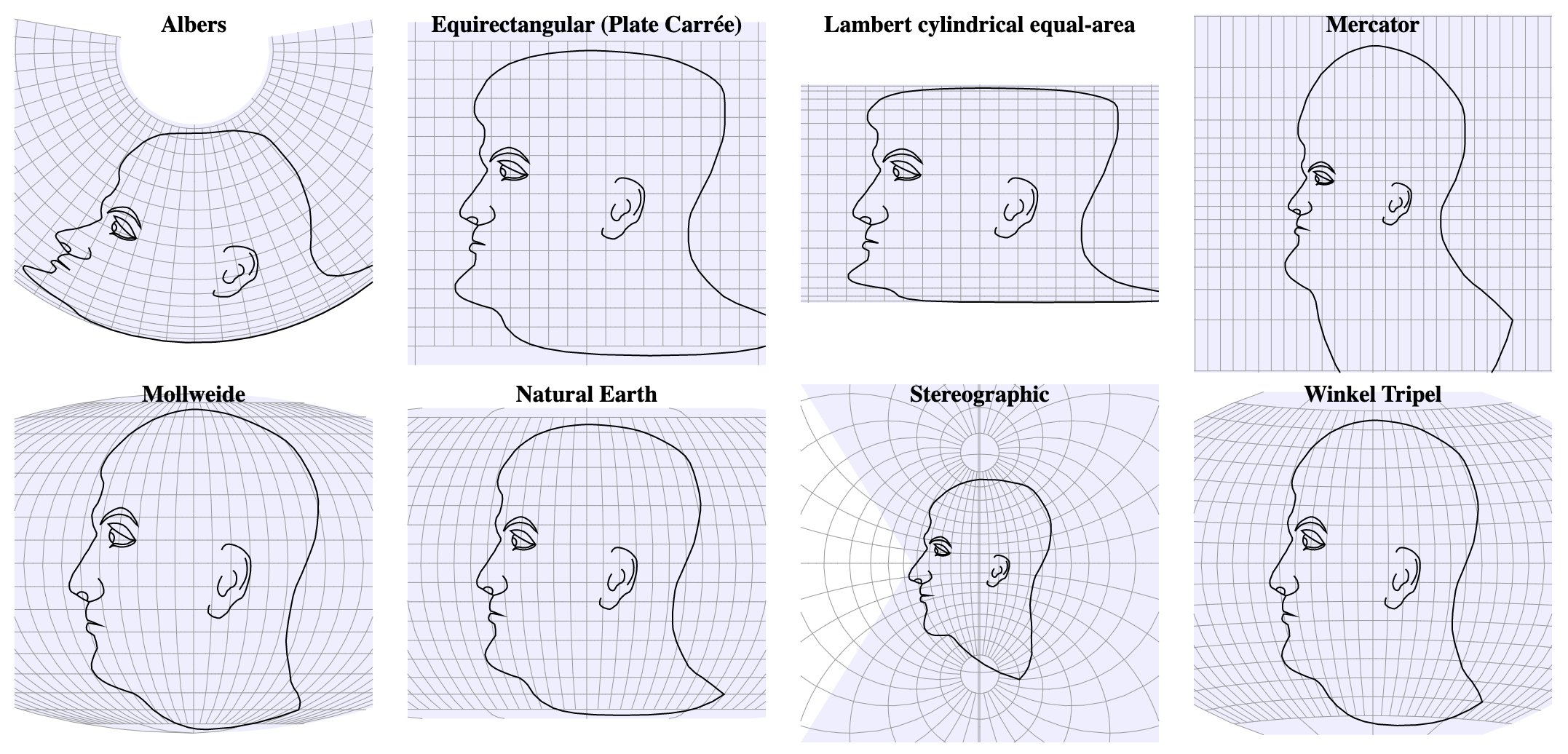
Image source
To summarize, vector data include the following:
spatial data (e.g., latitude, longitude) as points, lines, or polygons
attributes
a coordinate reference system
These are all the pieces of information you need to work with spatial data in R.
5.4.1 Simple features
R has a long history of packages for working with spatial data. For many years, the sp package was the standard and most widely used toolset for working with spatial data in R. This package laid the foundation for creating spatial data classes and methods in R, but unfortunately its development predated a lot of the newer tools that are built around the tidyverse. This makes it incredibly difficult to incorporate sp data objects with these newer data analysis workflows.
The simple features or sf package was developed to streamline the use of spatial data in R and to align its functionality with those provided in the tidyverse. The sf package has replaced sp as the fundamental spatial model in R for vector data. A major advantage of sf, as you’ll see, is its intuitive data structure that retains many familiar components of the data.frame (or more accurately, tibble).
The sf package provides a hierarchical data model that represents a wide range of geometry types - it includes all common vector geometry types and even allows geometry collections, which can have multiple geometry types in a single object. From the first sf package vignette we see:
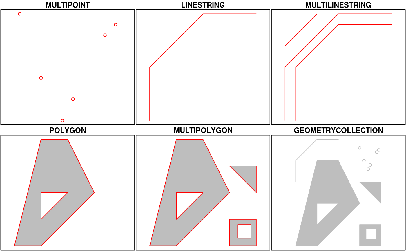
You’ll notice that these are the same features we described above, with the addition of “multi” features for collections of the same feature and geometry collections that include more than one type of feature.
5.4.2 Creating spatial data with simple features
Now that we’re setup, let’s talk about how the sf package can be used. After the package is loaded, you can check out all of the methods that are available for sf data objects. Many of these names are recognizable if you’re familiar with common geospatial analysis methods. We’ll use some of these later.
methods(class = 'sf') [1] [ [[<-
[3] [<- $<-
[5] aggregate anti_join
[7] arrange as.data.frame
[9] cbind coerce
[11] count dbDataType
[13] dbWriteTable df_spatial
[15] distinct dplyr_reconstruct
[17] drop_na duplicated
[19] filter full_join
[21] gather group_by
[23] group_split identify
[25] initialize inner_join
[27] left_join mapView
[29] merge mutate
[31] nest pivot_longer
[33] pivot_wider plot
[35] points print
[37] rbind rename_with
[39] rename right_join
[41] rowwise sample_frac
[43] sample_n select
[45] semi_join separate_rows
[47] separate show
[49] slice slotsFromS3
[51] spread st_agr
[53] st_agr<- st_area
[55] st_as_s2 st_as_sf
[57] st_as_sfc st_bbox
[59] st_boundary st_break_antimeridian
[61] st_buffer st_cast
[63] st_centroid st_collection_extract
[65] st_concave_hull st_convex_hull
[67] st_coordinates st_crop
[69] st_crs st_crs<-
[71] st_difference st_drop_geometry
[73] st_exterior_ring st_filter
[75] st_geometry st_geometry<-
[77] st_inscribed_circle st_interpolate_aw
[79] st_intersection st_intersects
[81] st_is_full st_is_valid
[83] st_is st_join
[85] st_line_merge st_m_range
[87] st_make_valid st_minimum_bounding_circle
[89] st_minimum_rotated_rectangle st_nearest_points
[91] st_node st_normalize
[93] st_point_on_surface st_polygonize
[95] st_precision st_reverse
[97] st_sample st_segmentize
[99] st_set_precision st_shift_longitude
[101] st_simplify st_snap
[103] st_sym_difference st_transform
[105] st_triangulate_constrained st_triangulate
[107] st_union st_voronoi
[109] st_wrap_dateline st_write
[111] st_z_range st_zm
[113] summarise text
[115] transform transmute
[117] ungroup unite
[119] unnest
see '?methods' for accessing help and source codeAll of the functions and methods in sf are prefixed with st_, which stands for ‘spatial and temporal’. This is kind of confusing but this is in reference to standard methods available in PostGIS, an open-source backend that is used by many geospatial platforms. An advantage of this prefixing is all commands are easy to find with command-line completion in sf, in addition to having naming continuity with the core, prior software.
There are two ways to create a spatial data object in R, i.e., an sf object, using the sf package.
Directly import a shapefile using
st_read()Convert an existing R object with latitude/longitude data that represent point features
You can create an sf object from any existing data.frame so long as the data include coordinate information (e.g., columns for longitude and latitude) and you are 100% certain about the CRS. We can do this with our metadat csv file. First, we’ll import it and clean it up a bit before we create the sf object.
metadat <- read_csv(here('data', 'metadat.csv')) |>
  select(station_name, station_longitude, station_latitude)
The st_as_sf() function can be used to make this data.frame into a sf object. We must identify which columns contain the coordinates and provide the CRS information, which is WGS84. You can use the EPSG code 4326 to indicate WGS84.
sfmetadat <- st_as_sf(metadat, coords = c('station_longitude', 'station_latitude'), crs = 4326)
sfmetadat
Simple feature collection with 8 features and 1 field
Geometry type: POINT
Dimension: XY
Bounding box: xmin: -82.16861 ymin: 28.77709 xmax: -82.10989 ymax: 28.82257
Geodetic CRS: WGS 84
# A tibble: 8 × 2
station_name geometry
* <chr> <POINT [°]>
1 Lake Panasoffkee 1 (-82.1243 28.80495)
2 Lake Panasoffkee 4 (-82.15162 28.8013)
3 Lake Panasoffkee 7 (-82.10989 28.77709)
4 Lake Panasoffkee 8 (-82.13859 28.82257)
5 Lake Panasoffkee at CR 455 (-82.11821 28.78867)
6 Lake Panasoffkee Outlet (-82.16861 28.79806)
7 Outlet River at Panacoochee Retreats (-82.1529 28.8)
8 Pana Vista Outlet River (-82.13974 28.80659)What does this show us? Let’s break it down.
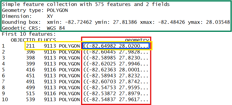
- In green, metadata describing components of the
sfobject - In yellow, a simple feature: a single record, or
data.framerow, consisting of attributes and geometry - In blue, a single simple feature geometry (an object of class
sfg) - In red, a simple feature list-column (an object of class
sfc, which is a column in the data.frame)
You’ll notice that the actual dataset looks very similar to a regular data.frame, with some interesting additions. The header includes some metadata about the sf object and the geometry column includes the actual spatial information for each feature. Conceptually, you can treat the sf object like you would a data.frame.
5.4.3 Coordinate reference systems
A big part of working with spatial data is keeping track of coordinate reference systems between different datasets. Remember that meaningful comparisons between datasets are only possible if the CRS is the same.
There are many, many types of reference systems and plenty of resources online that provide detailed explanations of the what and why behind the CRS (see spatialreference.org or this guide from NCEAS). For now, just realize that we can use a simple text string in R to indicate which CRS we want.
You may want to use another coordinate system, such as a projection that is regionally-specific. You can use the st_transform() function to quickly change and/or reproject an sf object. For example, if we want to convert a geographic to UTM projection:
sfmetadatutm <- sfmetadat |>
  st_transform(crs = '+proj=utm +zone=17 +datum=NAD83 +units=m +no_defs')
st_crs(sfmetadatutm)
Coordinate Reference System:
User input: +proj=utm +zone=17 +datum=NAD83 +units=m +no_defs
wkt:
PROJCRS["unknown",
BASEGEOGCRS["unknown",
DATUM["North American Datum 1983",
ELLIPSOID["GRS 1980",6378137,298.257222101,
LENGTHUNIT["metre",1]],
ID["EPSG",6269]],
PRIMEM["Greenwich",0,
ANGLEUNIT["degree",0.0174532925199433],
ID["EPSG",8901]]],
CONVERSION["UTM zone 17N",
METHOD["Transverse Mercator",
ID["EPSG",9807]],
PARAMETER["Latitude of natural origin",0,
ANGLEUNIT["degree",0.0174532925199433],
ID["EPSG",8801]],
PARAMETER["Longitude of natural origin",-81,
ANGLEUNIT["degree",0.0174532925199433],
ID["EPSG",8802]],
PARAMETER["Scale factor at natural origin",0.9996,
SCALEUNIT["unity",1],
ID["EPSG",8805]],
PARAMETER["False easting",500000,
LENGTHUNIT["metre",1],
ID["EPSG",8806]],
PARAMETER["False northing",0,
LENGTHUNIT["metre",1],
ID["EPSG",8807]],
ID["EPSG",16017]],
CS[Cartesian,2],
AXIS["(E)",east,
ORDER[1],
LENGTHUNIT["metre",1,
ID["EPSG",9001]]],
AXIS["(N)",north,
ORDER[2],
LENGTHUNIT["metre",1,
ID["EPSG",9001]]]]Above, we’ve used the “Proj4string” format of the CRS, instead of the EPSG code. This is another perfectly acceptable way to specify a CRS. Also note that transformations can only be done after the original data are correctly imported using the native CRS of the dataset.
5.4.4 Creating the map
Now that we’ve got the background info out of the way, we can focus on creating the map. For ggplot2, all we need is to use the geom_sf() geom.
# use ggplot with sf objects
ggplot() +
  geom_sf(data = sfmetadat)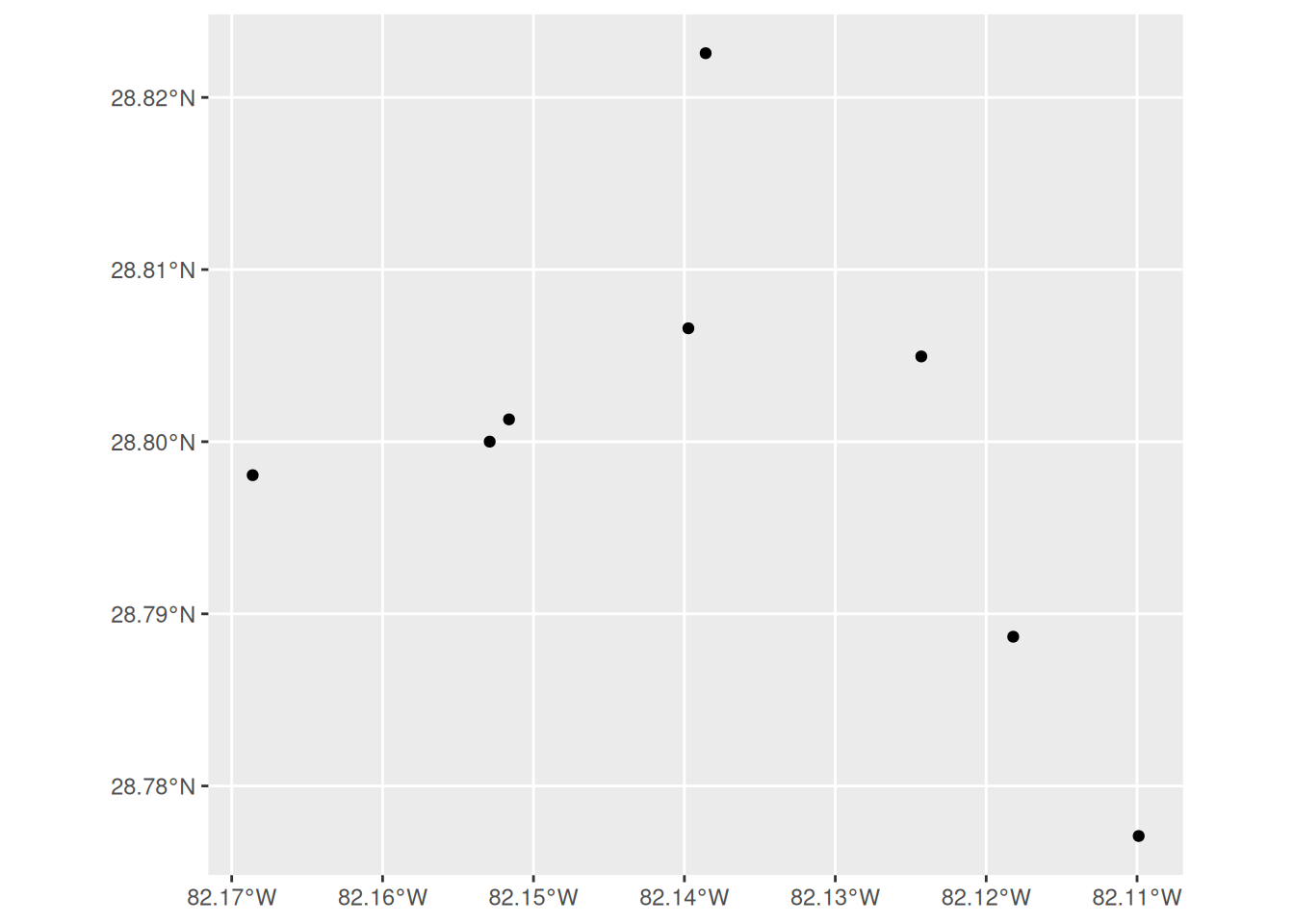
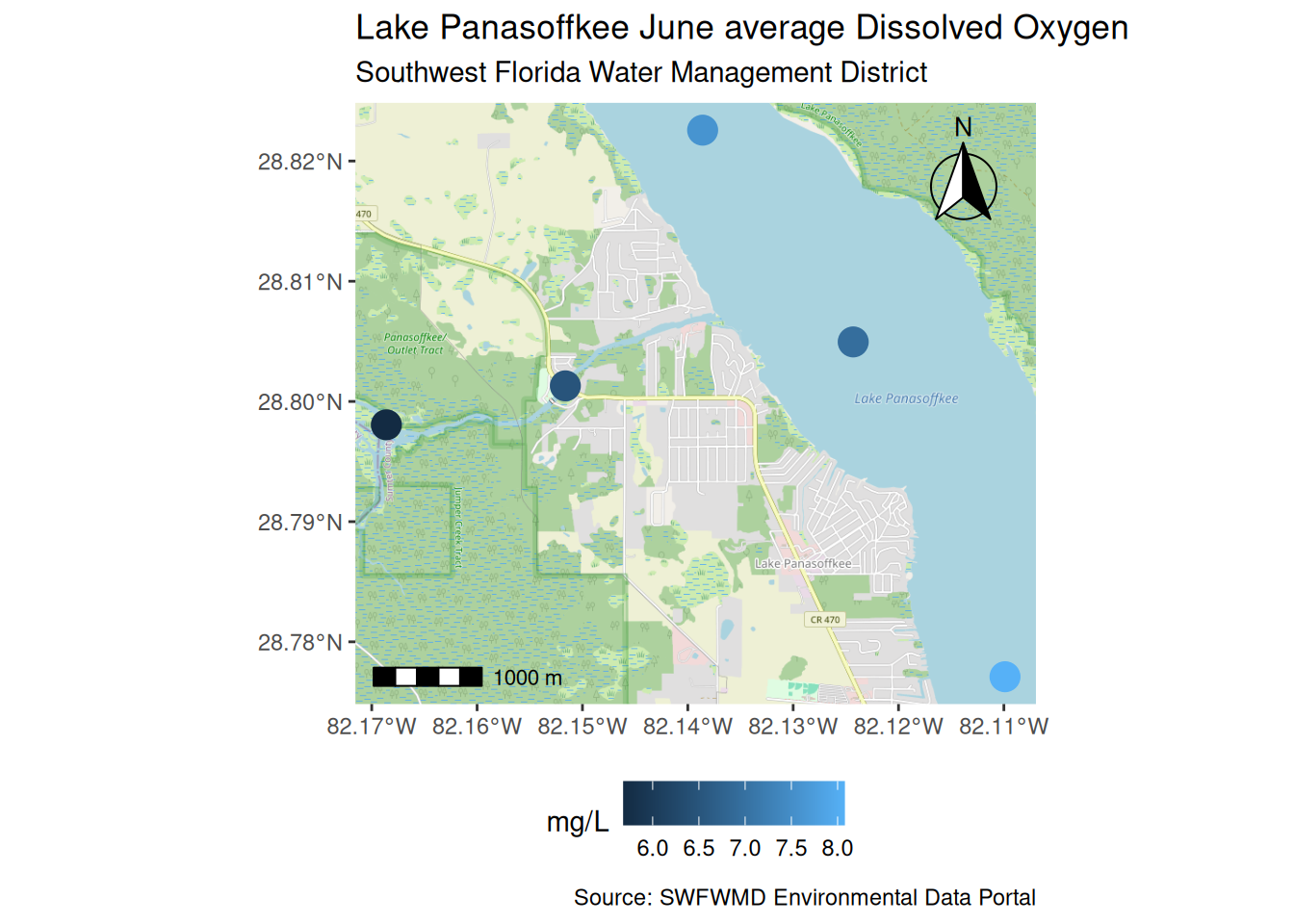
Cool, but that’s pretty boring. It just shows the station locations and has none of the features of a finished map. Let’s combine the station data with some of the water quality data to get an idea of how some of the parameters vary in space. We’ll look at mean dissolved oxygen in June.
To map the mean dissolved oxygen we need to summarize the data into a single value for each station since we can only show one value per station on the map. We’ll use the dplyr::summarise() function to calculate the mean value for each station. We’ll also filter to only include dissolved oxygen measurements in June.
meando <- wqdat |>
  dplyr::filter(parametertype_name == 'Dissolved Oxygen') |>
  dplyr::filter(month(timestamp) == 6) |>
  summarise(
    value = mean(value, na.rm = T),
    .by = c(station_name)
  )
meando
# A tibble: 5 × 2
station_name value
<chr> <dbl>
1 Lake Panasoffkee 7 8.08
2 Lake Panasoffkee 1 6.94
3 Lake Panasoffkee 8 7.59
4 Lake Panasoffkee Outlet 5.68
5 Lake Panasoffkee 4 6.49Now we can join the data to the sf object. The important steps here are to use an inner_join() (or left_join()) since we have less water quality stations than the total number of stations in the metadata. Also, the sf object (sfmetadat) must be the first argument to the join function to retain the sf class.
tomap <- inner_join(sfmetadat, meando, by = 'station_name')
tomap
Simple feature collection with 5 features and 2 fields
Geometry type: POINT
Dimension: XY
Bounding box: xmin: -82.16861 ymin: 28.77709 xmax: -82.10989 ymax: 28.82257
Geodetic CRS: WGS 84
# A tibble: 5 × 3
station_name geometry value
<chr> <POINT [°]> <dbl>
1 Lake Panasoffkee 1 (-82.1243 28.80495) 6.94
2 Lake Panasoffkee 4 (-82.15162 28.8013) 6.49
3 Lake Panasoffkee 7 (-82.10989 28.77709) 8.08
4 Lake Panasoffkee 8 (-82.13859 28.82257) 7.59
5 Lake Panasoffkee Outlet (-82.16861 28.79806) 5.68Let’s recreate our map but this time we’ll map the value column to color and increase the size of the points.
ggplot() +
  geom_sf(data = tomap, aes(color = value), size = 5)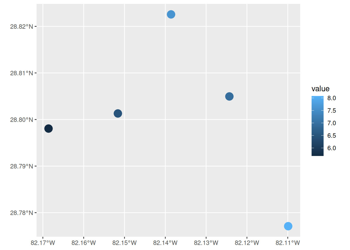
If you’d like a basemap behind your static ggplot map, the ggspatial package makes this easy with the annotation_map_tile() function, which pulls in tiles from an online source.
ggplot() +
  annotation_map_tile(zoomin = 0) +
  geom_sf(data = tomap, aes(color = value), size = 5)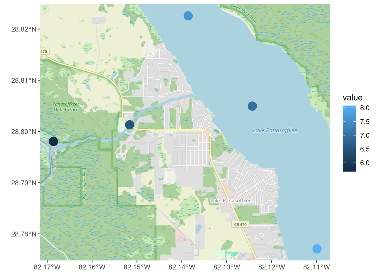
The package also includes annotation_scale() for a scale bar and annotation_north_arrow() for a directional arrow, both common elements of a finished map.
ggplot() +
  annotation_map_tile(zoomin = 0) +
  geom_sf(data = tomap, aes(color = value), size = 5) +
  annotation_scale(location = 'bl') +
  annotation_north_arrow(location = 'tr', style = north_arrow_fancy_orienteering())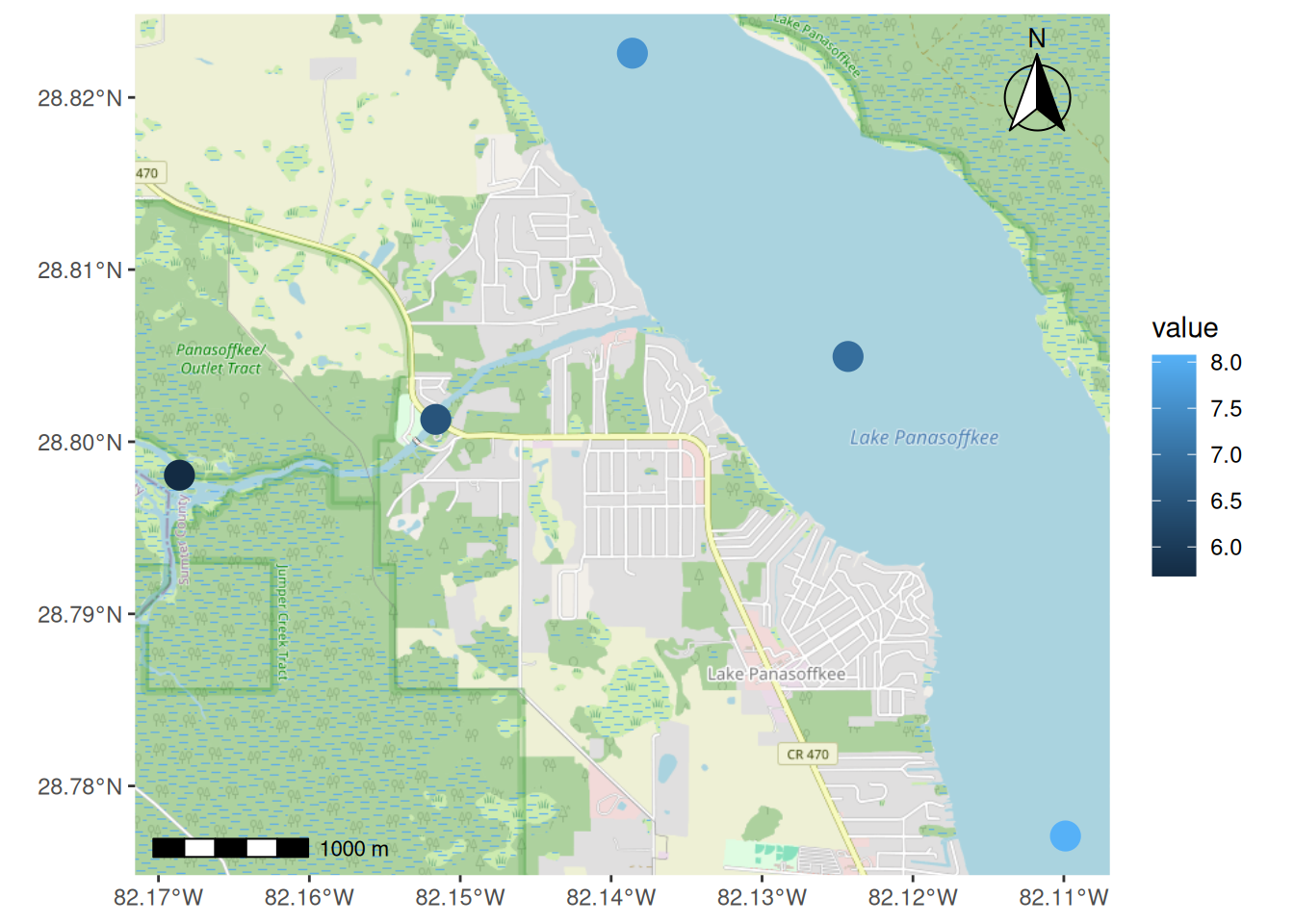
Let’s finish it up with some additional ggplot elements.
ggplot() +
  annotation_map_tile(zoomin = 0) +
  geom_sf(data = tomap, aes(color = value), size = 5) +
  annotation_scale(location = 'bl') +
  annotation_north_arrow(location = 'tr', style = north_arrow_fancy_orienteering()) +
  theme(
    legend.position = 'bottom'
  ) +
  labs(
    title = 'Lake Panasoffkee June average Dissolved Oxygen',
    subtitle = 'Southwest Florida Water Management District',
    color = 'mg/L',
    caption = 'Source: SWFWMD Environmental Data Portal'
  )
Static maps are all well and good, but sometimes we want to be able to interact with your data. The mapview package makes this easy. All we need to do is pass our sf object to the mapview() function and it will create an interactive map in the RStudio Viewer pane. Notice that it already includes many of the elements we had to add by hand to the ggplot map.
mapview(tomap, zcol = 'value')We can also change the color ramp and clean it up a bit. To match the blue gradient ggplot uses by default for continuous values, we can interpolate between its two endpoint colors, '#132B43' and '#56B1F7', using colorRampPalette(). This function is part of the grDevices package, which comes with base R.
mapview(tomap, zcol = 'value', col.regions = colorRampPalette(c('#132B43', '#56B1F7')), legend = TRUE, layer.name = 'Dissolved Oxygen (mg/L)')If you’d like to share this interactive map with others who don’t use R, you can save it as an html file using the mapshot() function from mapview. Passing selfcontained = TRUE bundles all of the JavaScript and CSS the map depends on directly into that one file, rather than a separate folder of dependencies, so you can email or move a single file and it will still work.
m <- mapview(tomap, zcol = 'value', col.regions = colorRampPalette(c('#132B43', '#56B1F7')), legend = TRUE, layer.name = 'Dissolved Oxygen (mg/L)')
mapshot(m, url = here('figs/swfwmd_examples', 'sfmetadat.html'), selfcontained = TRUE)
The saved file will look like this when opened in a web browser. There’s a lot more we can do with mapview but the point is that these maps are incredibly easy to make with sf objects and they offer a lot more functionality than static plots.
5.5 Next steps
This concludes our training. I hope you’ve enjoyed the material and found the content useful. Please continue to use this website as a resource for developing your R skills and checkout our Data and Resources page for additional learning material.