A soft introduction to Shiny
Outline
- What is Shiny?
- New concepts
- A simple example
- A better example
- Sharing your applications
- Final thoughts
- Resources
Disclaimer: The Mastering Shiny text is a much more comprehensive and informative text on developing Shiny apps. Many of the ideas and (only some) of the text here were adapted from that resource.
What is Shiny?
Shiny is an R package that lets you create rich, interactive web applications. Shiny lets you take an existing R script and expose it using a web browser so that you or anybody else can use it outside of R. Shiny is commonly used to:
- Communicate complex workflows to a non-technical audience with informative visualizations and interactive components
- Share your analysis easily with colleagues without having to walk them through details of your script
- Help inform your understanding of an analysis by creating a user interface to quickly evaluate data
In the applied sciences world, Shiny can be a very important tool to “bridge the research-management divide”. A very simple example is the use of Shiny to replace a 500 page document that has hundreds of figures with a simple application that allows the user to jump to an exact slice of the data that they want.
There are many advantages to using Shiny over other platforms for creating web applications. As R users, the value of Shiny is that you only need to know how to use R. You do not need to know anything about web programming, such as HTML, CSS, or JavaScript. On the other hand, Shiny gives you the power to tap into the broader suite of web programming tools when you’re ready to or have a need to expand your application.
More simply, Shiny lets you create a web interface for any R workflow. This means that any custom analysis or graphic you’ve made can be fully integrated into your dashboard, unlike other platforms that may have rigid and less customizable templates designed for ease of use.
New concepts
Shiny can be challenging at first because it introduces a new way of thinking about your code. “Simple” R scripts are run linearly, being read from top to bottom. You write your script, source the code to your console, and get some results or objects created after running the script.
A Shiny app runs from an R script, but instead of executing code linearly, it uses reactive programming that detects when an input is changed on the application, runs the minimal amount of code that uses that input, then updates the output as needed. So, rather than thinking of the script as linear, think of it as having interconnected components that share pieces of information to produce the results.
This can be daunting at first because it requires you think about which pieces of your code require inputs from other pieces and how that information is used to create output. Reactivity can be conceptualized by the building blocks of a Shiny app. Every Shiny app has the following:
- User interface (UI): Includes all inputs and outputs, as well as the appearance of the dashboard. Here, when we say “output” we mean the final product (e.g. a plot, table, etc.) that is placed on the
ui, but created by processing inputs sent to theserver. In web-speak, this is the front end. - Server: The guts or engine of how the inputs are used to create the outputs, this is where the working parts of your analysis live. It can be as simple or as complicated as you like. In web-speak, this is the back end.
At it’s core, a Shiny app is an R script that contains The ui and server components. In practice, it looks like this:
library(shiny)
ui <- fluidPage()
server <- function(input, output){}
shinyApp(ui = ui, server = server)
You “launch” or run the dashboard by sourcing the script or hitting the green “Run App” button on the top right.
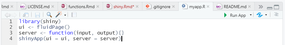
If you run this code, you’ll see a local web browser pop up. It will be empty because this app does nothing, but this is only a starting point. All we need to do is populate the ui and server objects with code to do some things.
A simple example
Now let’s make our simple example do something. As with most problems, it’s good to start with identifying where you want to go and then work backwards to figure out how to get there. Let’s end with a simple histogram to visualize some data for the normal distribution, but with different sample sizes.
dat <- rnorm(100)
hist(dat)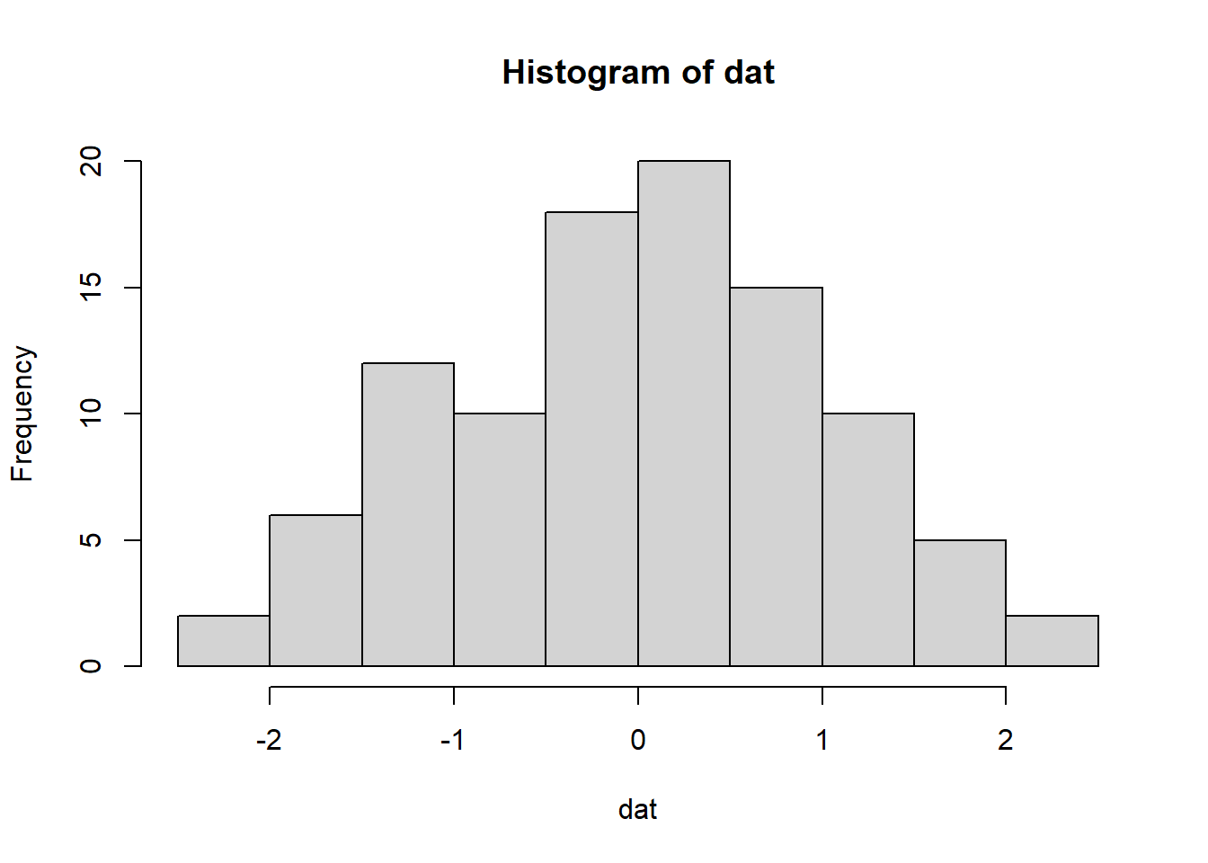
Changing the sample size:
dat <- rnorm(10)
hist(dat)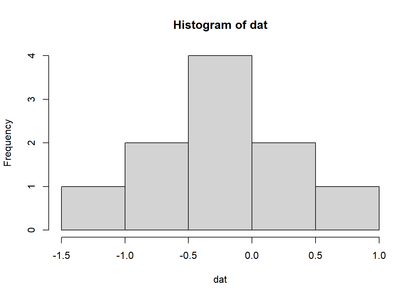
To make a Shiny app out of this, we need to identify our inputs and our outputs. The input in this case is what we want to be able to modify (the sample size) and the output is the plot. Inputs/outputs go in the ui object. The server takes the inputs, does something with them, then sends the results back to the ui. Putting this into our template would look something like this:
library(shiny)

ui <- fluidPage(
  numericInput(inputId = 'n', label = 'Sample size', value = 50),
  plotOutput('myplot')
)

server <- function(input, output){
  output$myplot <- renderPlot({
    dat <- rnorm(input$n)
    hist(dat)
  })
}

shinyApp(ui = ui, server = server)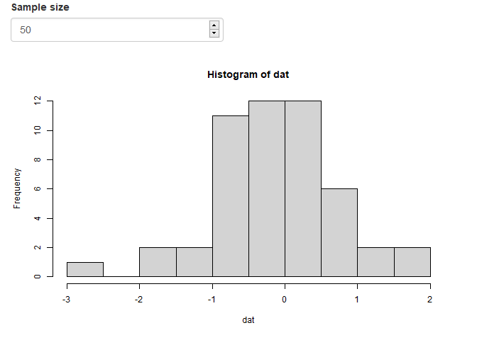
Okay, so what is happening under the hood when you change the sample size?
- The
inputvaluen(you name it) from theuiis sent to theserver, seen asinput$n. - The
datobject is created as a random sample with sizenand then a histogram is created as reactive output withrenderPlot - The plot output named
myplot(you name it) is appended to theoutputlist of objects - The plot is then rendered on the
uiside usingplotOutputby referencing themyplotname from theoutputobject.
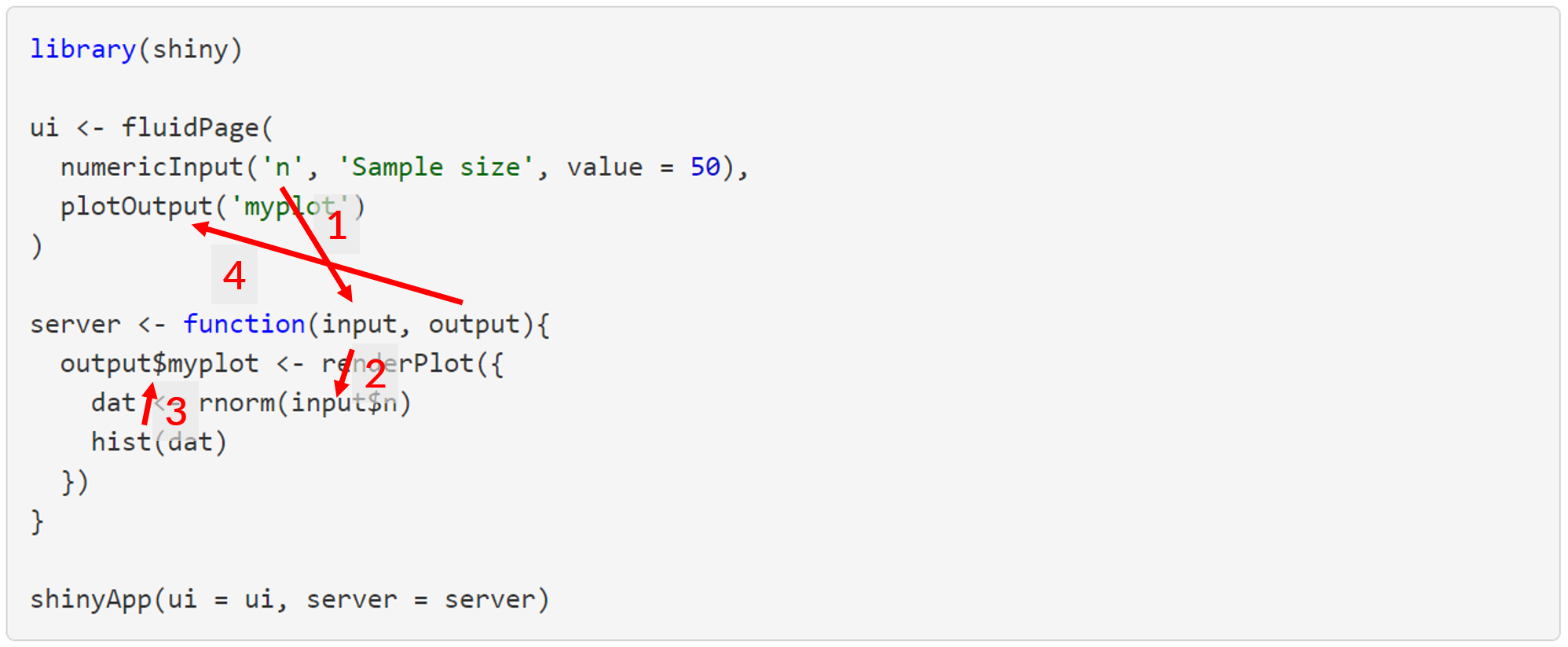
All of this happens each time the input values are changed, such that the output reacts to any change in the input. This is a fundamental principle of Shiny functionality.
There are some general rules and concepts about Shiny reactivity that are shown here that apply to most Shiny applications.
All input objects are defined in the
uiobject, given a name inside the input function and then referenced in theserverfile byinput$name(input$nin this case).numericInput(inputId = 'n', label = 'Sample size', value = 50)All output objects to use in the
uiobject are created in theserverobject by assigning a “rendered” object to theoutputobject byoutput$name(output$myplotin this case).output$myplot <- renderPlot({ dat <- rnorm(input$n) hist(dat) })The
uifile controls where and when the output is rendered, typically using a function namedfooOutput()(foomeaning generic, e.g.,plot,table, etc.) that has a complementary reactive function namedrenderFoo()in theserverfile.plotOutput('myplot')The
uifile can be declared with a function (fluidPage()here as one type of layout) with at least two inputs (one input, one output) separated by commas.The
serverfile can be declared with theserver()function, where the input is evaluated as a standalone group of operations with the curly braces{}.
You’re well on your way to understanding Shiny once you master the concepts demonstrated by the simple example above. Once you master the concepts, the rest is just finding the right reactive functions that do what you need and then fiddling with the layout.
An overview of the standard Shiny input options is here: https://shiny.rstudio.com/gallery/widget-gallery.html
A totally non-exhaustive list of the reactive render and complementary output functions that you’ll most commonly use are renderPlot()/plotOutput(), renderTable()/tableOutput(), renderText()/textOutput(), and renderUI()/uiOutput(). Just remember renderFoo() for server and fooOutput() for ui.
A better example
Last year we talked about using R to write your own functions. We started with a simple example of filtering and plotting data from the FWC Fisheries Independent Monitoring dataset. Here we’ll do the same, but develop a Shiny app around this function.
First, we import the data:
url <- 'https://raw.githubusercontent.com/tbep-tech/tbep-r-training/013432d6924d278a9fbb151591ddcfd5b7de87ab/data/otbfimdat.csv'
otbfimdat <- read.csv(url, stringsAsFactors = F)
Now we create a function that filters these data by species, size range, and gear and then plots the results over time. The creation and purpose of this function is explained in the link above, but in short, we use it to filter by species size classes to plot trends over time.
plotcatch <- function(name, szrng, gearsel, datin){

  subdat <- datin %>%
    filter(Commonname %in% name) %>%
    filter(avg_size > szrng[1] & avg_size < szrng[2]) %>%
    filter(Gear %in% gearsel) %>%
    mutate(Sampling_Date = as.POSIXct(
      Sampling_Date,
      format = '%Y-%m-%d %H:%M:%S',
      tz = 'America/New_York'
      )
    )

  p <- ggplot(subdat, aes(x = Sampling_Date, y = TotalNum)) +
    geom_point() +
    scale_y_log10() +
    geom_smooth(method = 'lm') +
    labs(
      x = NULL,
      y = 'Total catch',
      title = paste0(name, " catch in gear ", gearsel),
      subtitle = paste0("Data subset to ave size between ", szrng[1], '-', szrng[2], " mm")
    )

  p

}
Now we show how the function is used. We want to plot red drum in the size range 25 to 30 mm for gear type 20.
plotcatch('Red Drum', c(25, 30), 20, otbfimdat)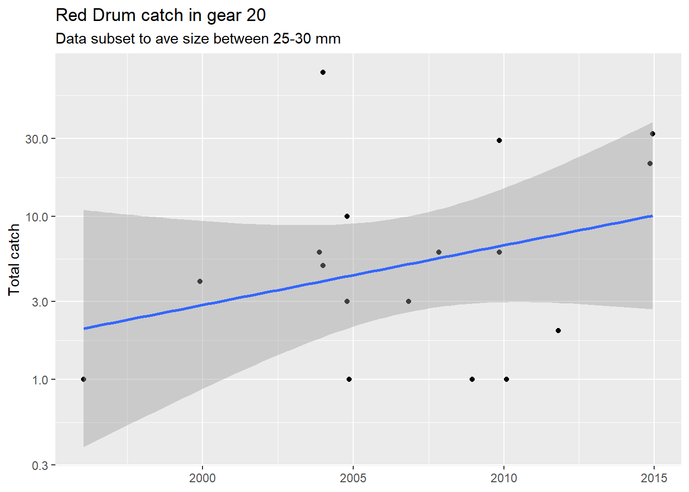
Functions are beneficial because they simplify the working parts of your code, minimize errors with copy/paste, and increase reproducibility. Let’s step it up a notch and wrap a Shiny app around this function. This could be useful for your own needs (rapidly checking catch data) or for sharing this workflow with your colleagues that might not use R.
As stated in the simple example above, we first need to identify where we want to go to determine what we need to include in the Shiny app. We want to create the plot by providing options on which fish, size ranges, and gear type to evaluate. Before we do anything with Shiny, we can create three objects that include those options.
fish <- unique(otbfimdat$Commonname)
size <- range(otbfimdat$avg_size, na.rm = T)
gear <- unique(otbfimdat$Gear)
Then we can start working on the ui inputs. Based on the type of data in the inputs, we can figure out which of the Shiny input functions we need to include in our ui function. The fish and gear types are categorical data, so selectInput() is a correct option. The size values are continuous data that could be chosen with the sliderInput() function to pick a range of values. Each input function has a unique id, label, set of choices, and default selected value(s).
ui <- fluidPage(
  selectInput(inputId = 'fishsel', label = 'Select species', choices = fish,
              selected = 'Red Drum'),
  sliderInput(inputId = 'sizesel', label  = 'Select size range (mm)',
              min = size[1], max = size[2], value = size),
  selectInput(InputId = 'gearsel', label = 'Select gear', choices = gear,
              selected = '20')
)
Then, on the server side we need to use the inputs in our plotting function. We also use renderPlot() since the inputs are used reactively and assign the plot to the output object with a name of our choosing (plo).
server <- function(input, output){
  output$plo <- renderPlot({
    plotcatch(
      name = input$fishsel,
      szrng = input$sizesel,
      gearsel = input$gearsel,
      datin = otbfimdat
      )
  })
}
Then we go back to the ui and add the plot output using the name we assigned to the output in the last step.
ui <- fluidPage(
  selectInput(inputId = 'fishsel', label = 'Select species', choices = fish,
              selected = 'Red Drum'),
  sliderInput(inputId = 'sizesel', label  = 'Select size range (mm)',
              min = size[1], max = size[2], value = size),
  selectInput(inputId = 'gearsel', label = 'Select gear', choices = gear,
              selected = '20'),
  plotOutput('plo')
)
All together, it should look something like this. Note that we need to include all the dependencies since Shiny apps are modular just like regular R scripts. This includes the libraries, the code for the plotting function, data import, and options used in the Shiny inputs. The actual Shiny components are a small part of this app at the bottom.
library(shiny)
library(tidyverse)

# plotting function
plotcatch <- function(name, szrng, gearsel, datin){

  subdat <- datin %>%
    filter(Commonname %in% name) %>%
    filter(avg_size > szrng[1] & avg_size < szrng[2]) %>%
    filter(Gear %in% gearsel) %>%
    mutate(Sampling_Date = as.POSIXct(
      Sampling_Date,
      format = '%Y-%m-%d %H:%M:%S',
      tz = 'America/New_York'
      )
    )

  p <- ggplot(subdat, aes(x = Sampling_Date, y = TotalNum)) +
    geom_point() +
    scale_y_log10() +
    geom_smooth(method = 'lm') +
    labs(
      x = NULL,
      y = 'Total catch',
      title = paste0(name, " catch in gear ", gearsel),
      subtitle = paste0("Data subset to ave size between ", szrng[1], '-', szrng[2], " mm")
    )

  p

}

# import data
url <- 'https://raw.githubusercontent.com/tbep-tech/tbep-r-training/013432d6924d278a9fbb151591ddcfd5b7de87ab/data/otbfimdat.csv'
otbfimdat <- read.csv(url, stringsAsFactors = F)

# get selection options
fish <- unique(otbfimdat$Commonname)
size <- range(otbfimdat$avg_size, na.rm = T)
gear <- unique(otbfimdat$Gear)

# Shiny UI
ui <- fluidPage(
  selectInput(inputId = 'fishsel', label = 'Select species', choices = fish,
              selected = 'Red Drum'),
  sliderInput(inputId = 'sizesel', label  = 'Select size range (mm)',
              min = size[1], max = size[2], value = size),
  selectInput(inputId = 'gearsel', label = 'Select gear', choices = gear,
              selected = '20'),
  plotOutput('plo')
)

# Shiny server
server <- function(input, output){
  output$plo <- renderPlot({
    plotcatch(
      name = input$fishsel,
      szrng = input$sizesel,
      gearsel = input$gearsel,
      datin = otbfimdat)
  })
}

# run app
shinyApp(ui = ui, server = server)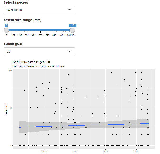
This is a working application that does what we want. There are of course improvements that can be made for simplifying the interface and making the code more efficient. These might not seem important now, but you’ll get a sense of good coding practices for Shiny once you develop more apps. Here are a few considerations:
- Change the data import workflow so that the input data is imported more efficiently into the application. Since these data are “static”, there’s no need to import a massive csv each time. Save it as an RData object outside of the app and import that instead. This will cut down on load times.
- Create a script for functions that is sourced by the application. This will make the application code easier to read and simpler to manage in the long run.
- Think about the layout of the application. This can influence how a “user” experiences an application. A terrible layout will make for a terrible experience. There are many options for Shiny (native Shiny layouts, flexdashboard, shinydashboard, rendered in RMarkdown)
- Create dynamic user inputs that change based on values of the other inputs. For example, Red Drum have a typical size range and it may not make sense to have the default ranges as the entire range of all fish in the database.
Here’s the source code and hosted application that includes these changes. If you’re curious, the file structure is shown in the README. It works just the same as any regular RStudio project, i.e., there’s a root/working directory and all file paths are relative.
Final thoughts
As with all one hour tutorials, we’ve barely scratched the surface of how to use Shiny and what it can provide for you. If you can master Shiny, you’ll find it a valuable asset both for your own work and for collaborating with others, particularly those that need R results to make decisions. Please continue to learn how to use Shiny, using the content in this tutorial and through the resources below.
If all of this is daunting, try opening a new RMarkdown file in RStudio using the Shiny template. This is a working application. Try modifying, adding, or deleting any of the code to see how it works. Learning by doing is the best approach.
Resources
- Mastering Shiny: By Hadley Wickham, to be published June 2021
- RStudio Shiny cheatsheet
- R Shiny Gallery: Great examples, including source code
- TBEP Shiny apps
- Example catch data application and source code