# enable repos
options(repos = c(
    tbeptech = 'https://tbep-tech.r-universe.dev',
    CRAN = 'https://cloud.r-project.org'))

# install (only need to do once)
install.packages(c('shiny', 'plotly', 'tbeptools', 'tidyverse'))

# load the packages
library(plotly)
library(shiny)
library(tbeptools)
library(tidyverse)2 Fundamentals
Learning objectives
Use the Shiny framework to develop interactive applications accepting user input to render outputs from arbitrary R functions.
2.1 Install packages
Let’s begin by installing and loading the packages used for this workshop. This will already be installed if you’re using Posit Cloud.
2.2 A simple example
We’ll start with a simple application of Shiny. As with most problems, it’s good to start with identifying where you want to go and then work backwards to figure out how to get there. Let’s end with a simple histogram to visualize some data for the normal distribution, but with different sample sizes. To start, we create the simple plot with the random data of a given sample size.
dat <- rnorm(100)
hist(dat)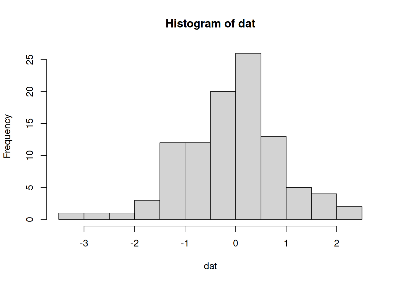
Changing the sample size:
dat <- rnorm(10)
hist(dat)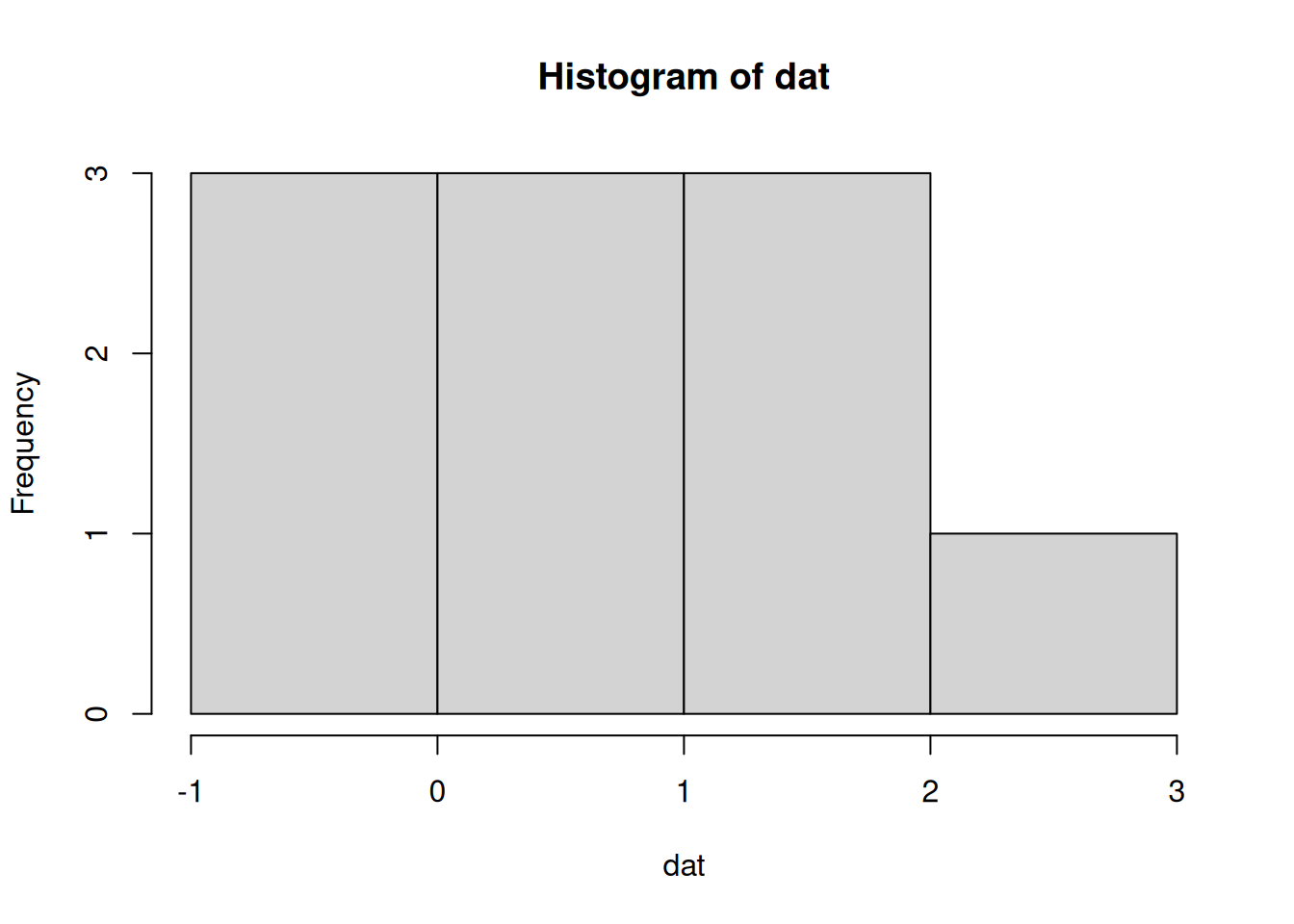
We need to identify our inputs and outputs to use this in a Shiny framework. The input is what we want to be able to modify (the sample size) and the output is the plot. This can all be done in a single script by creating a ui and server component. Inputs and outputs go in the ui object and will include our selection for the sample size and the resulting plot. The server processes the inputs and produces the output, which will be the random sample generation and creation of the plot.
Using our template from before:
library(shiny)
ui <- fluidPage()
server <- function(input, output){}
shinyApp(ui = ui, server = server)
Then putting this into our template would look something like this:
library(shiny)

ui <- fluidPage(
  numericInput(inputId = 'n', label = 'Sample size', value = 50),
  plotOutput('myplot')
)

server <- function(input, output){
  output$myplot <- renderPlot({
    dat <- rnorm(input$n)
    hist(dat)
  })
}

shinyApp(ui = ui, server = server)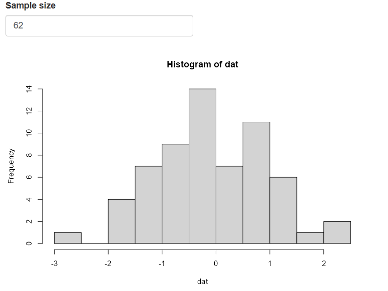
Okay, so what is happening under the hood when you change the sample size?
The
inputvaluen(you name it) for theserveris chosen by the user from theui. This uses thenumericInput()widget.ui <- fluidPage( numericInput(inputId = 'n', label = 'Sample size', value = 50), plotOutput('myplot') )Shiny recognizes that the
input$nvalue comes from theuiand is used by theserverto create the random sampledat.server <- function(input, output){ output$myplot <- renderPlot({ dat <- rnorm(input$n) hist(dat) }) }The
datobject with sample sizenis then used to create a histogram.server <- function(input, output){ output$myplot <- renderPlot({ dat <- rnorm(input$n) hist(dat) }) }The plot output named
myplot(you name it) is created using therenderPlot()function and appended to theoutputlist of objects in theserverfunction.server <- function(input, output){ output$myplot <- renderPlot({ dat <- rnorm(input$n) hist(dat) }) }The plot is then rendered on the
uiusingplotOutputby referencing themyplotname from theoutputobjectui <- fluidPage( numericInput(inputId = 'n', label = 'Sample size', value = 50), plotOutput('myplot') )
This is what it looks like in a simple flowchart.
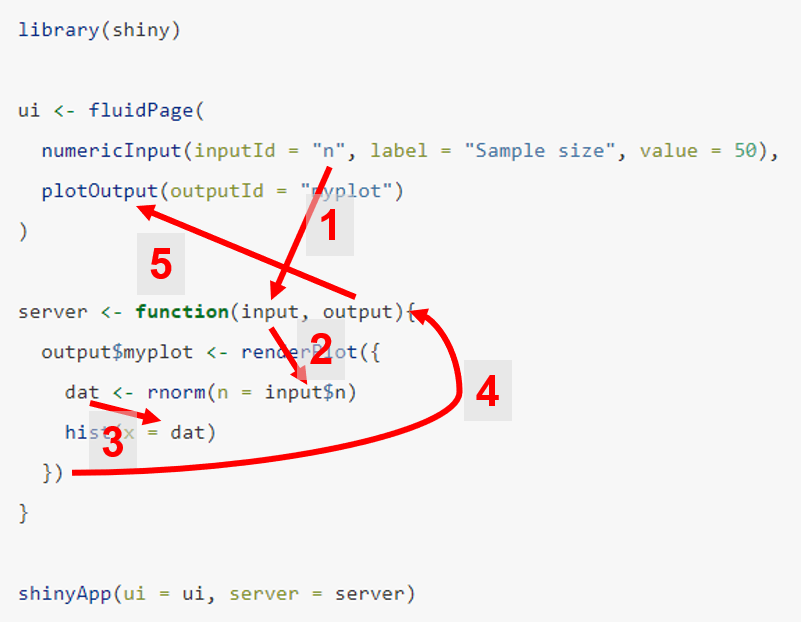
All of this happens each time the input values are changed, such that the output reacts to any change in the input.
One other piece of advice to understand app fundamentals is about the standard naming convention for reactive functions. Notice in the example that plotting components for the server and ui have paired functions named renderPlot() and plotOutput(), respectively. Every component of a working Shiny app requires these two pieces to create and show content. The naming convention is similar for other elements of an app, e.g., renderTable() and tableOutput() for tabular content.
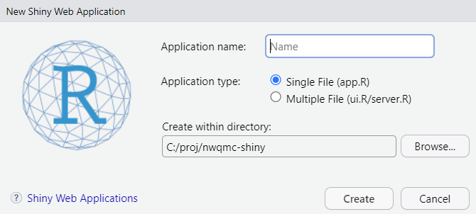
2.3 Using the RStudio template
Another useful way of learning the basics of the ui and server is to use the built-in Shiny template in RStudio. Under File -> New File -> Shiny Web App…, you can open a script that has a working Shiny app. Tinkering with this file will teach you a lot about how Shiny works.
For now, let’s go with the single file option that puts the entire application in app.R rather than splitting it in two (ui.R, server.R).
Let’s try it again from scratch, recreating our simple histogram example. Here’s what the template file looks like:
#
# This is a Shiny web application. You can run the application by clicking
# the 'Run App' button above.
#
# Find out more about building applications with Shiny here:
#
#    https://shiny.posit.co/
#

library(shiny)

# Define UI for application that draws a histogram
ui <- fluidPage(

    # Application title
    titlePanel("Old Faithful Geyser Data"),

    # Sidebar with a slider input for number of bins
    sidebarLayout(
        sidebarPanel(
            sliderInput("bins",
                        "Number of bins:",
                        min = 1,
                        max = 50,
                        value = 30)
        ),

        # Show a plot of the generated distribution
        mainPanel(
           plotOutput("distPlot")
        )
    )
)

# Define server logic required to draw a histogram
server <- function(input, output) {

    output$distPlot <- renderPlot({
        # generate bins based on input$bins from ui.R
        x    <- faithful[, 2]
        bins <- seq(min(x), max(x), length.out = input$bins + 1)

        # draw the histogram with the specified number of bins
        hist(x, breaks = bins, col = 'darkgray', border = 'white',
             xlab = 'Waiting time to next eruption (in mins)',
             main = 'Histogram of waiting times')
    })
}

# Run the application
shinyApp(ui = ui, server = server)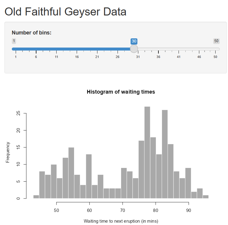
This app template has a lot more pieces than the last example. In particular, the sidebarLayout() format is used for the ui with a sidebarPanel() for the widget selection and a mainPanel() for the plot output.
We can replace the relevant pieces with those used in our initial histogram app. What does this app do differently from the original?
Your final product should look like this:
library(shiny)

# Define UI for application that draws a histogram
ui <- fluidPage(

    # Application title
    titlePanel("My awesome histogram app"),

    # Sidebar with a numeric input for sample size
    sidebarLayout(
        sidebarPanel(
           numericInput(inputId = 'n', label = 'Sample size', value = 50)
        ),

        # Show a plot of the generated distribution
        mainPanel(
           plotOutput("distPlot")
        )
    )
)

# Define server logic required to draw a histogram
server <- function(input, output) {

    output$distPlot <- renderPlot({

      # generate random sample of size n
        x <- rnorm(input$n)

        # draw the histogram
        hist(x)

    })
}

# Run the application
shinyApp(ui = ui, server = server)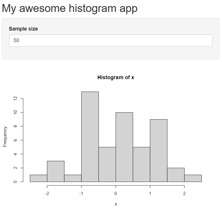
This is the same app as before, but we’ve only replaced the relevant pieces, i.e., the title, the numeric input widget, and a simpler plot.
Let’s spice it up by adding a widget for changing the histogram color. There’s a lot to say about “widgets” - Shiny has many you can choose from depending on the type of input you need. This page provides an overview of available widgets. We’ll add the selectInput() widget for the colors.
library(shiny)

# Define UI for application that draws a histogram
ui <- fluidPage(

    # Application title
    titlePanel("My awesome histogram app"),

    # Sidebar with a numeric input for sample size
    sidebarLayout(
        sidebarPanel(
           numericInput(inputId = 'n', label = 'Sample size', value = 50),
           selectInput(inputId = 'col', label = 'Choose color', choices = c('red', 'blue', 'green'))
        ),

        # Show a plot of the generated distribution
        mainPanel(
           plotOutput("distPlot")
        )
    )
)

# Define server logic required to draw a histogram
server <- function(input, output) {

    output$distPlot <- renderPlot({

      # generate random sample of size n
        x <- rnorm(input$n)

        # draw the histogram
        hist(x, col = input$col)

    })
}

# Run the application
shinyApp(ui = ui, server = server)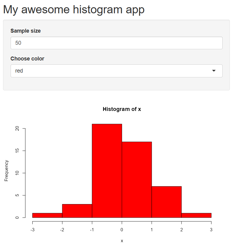
Notice how the random sample changes when you update the color. Why is that? How can we fix this?
2.4 Debugging a Shiny app
Figuring out why and where your code might break in an application is challenging because of the reactivity inherent in a Shiny app. You can’t just run the app step by step as you would a normal R script. The browser() function can be used to “step inside” the R code of an app. The browser() function can work with any arbitrary R function and works similarly with Shiny apps that share many similarities with functions. We’ll first demonstrate how to use it with a simple function.
my_func <- function(n){

  x <- rnorm(n)
  hist(x)

}
my_func(n = 100)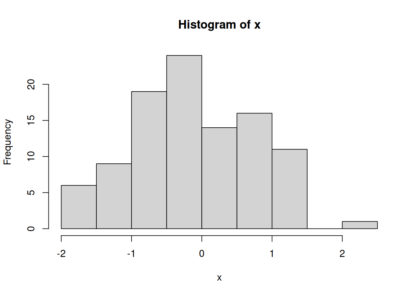
Let’s save this code in a new R script, place the browser() function inside of my_func(), and run the code again.
my_func <- function(n){

  browser()
  x <- rnorm(n)
  hist(x)

}
my_func(n = 100)
Three things happen when the code is run:
The source code now highlights the
browser()function with a green arrow. This indicates your current location inside the browser.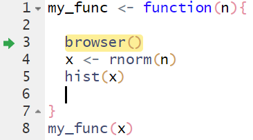
The console will show that you’re in the browser.
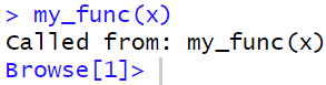
Browser controls appear at the top of the console.

You can now “step” through the function using these controls or by pressing “enter”. The code will run as intended if there are no errors. You will exit the browser once the code execution is complete or if you hit the “Stop” button on the controls. Any objects created inside the function will be available for you to investigate if there are issues.
The browser() works the same with a Shiny app. You’ll use it within objects in the server component since these behave as functions. For example:
# Define server logic required to draw a histogram
server <- function(input, output) {

  output$distPlot <- renderPlot({
    browser()
    # generate random sample of size n
    x <- rnorm(input$n)

    # draw the histogram
    hist(x, col = input$col)

  })
}
The browser takes a bit of practice to get comfortable, but you’ll quickly find it useful for debugging apps, particularly those that have multiple working parts. For more information on debugging, checkout the article Debugging Shiny applications.
2.5 Create a complex Shiny app
Now that we know the basics of a Shiny app and how to debug, we’ll create a more involved example similar to one you may encounter with water quality data. For example, a common use of Shiny is to plot data where there are multiple options to choose the type of data you have, e.g., multiple sampling stations and multiple parameters. Shiny can be used to easily subset parts of the data that are of interest rather than producing all possible combinations.
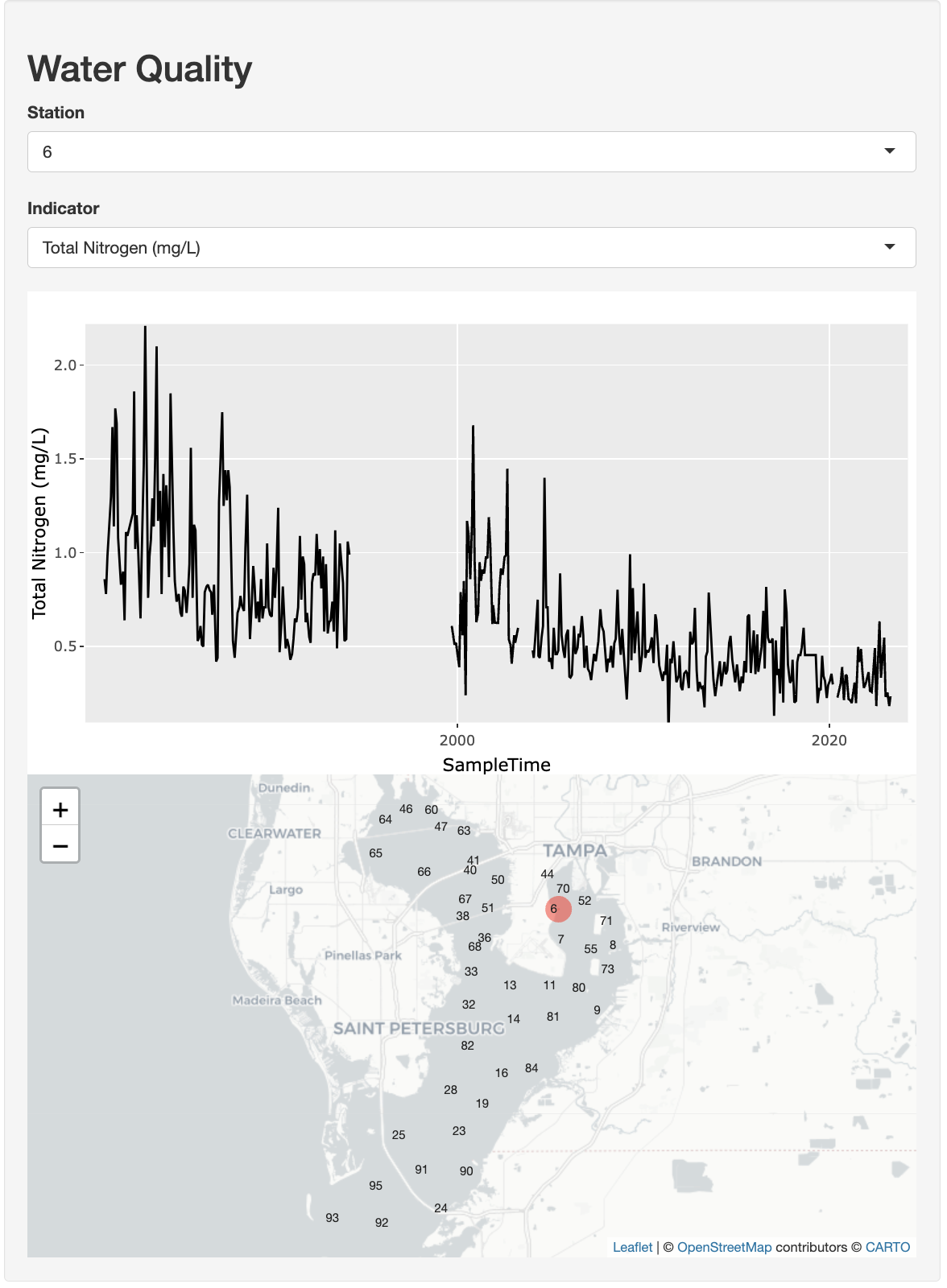
We’ll create an interactive time series plot where users can select a station from a drop-down menu and see the time series for any of the available indicators chosen from another drop-down selection.
In this extended tutorial, we will explore more complex topics of reactivity and data wrangling with dplyr. We’ll also demonstrate the advantages of using R libraries that wrap JavaScript functionality, in particular using plotly to make static plots more interactive.
2.5.1 Prepare data
First, let’s prepare the water quality data for our app using a dataset from the Tampa Bay Estuary Program R package tbeptools.
library(tbeptools)
epcdata
# A tibble: 28,501 × 26
bay_segment epchc_station SampleTime yr mo Latitude Longitude
<chr> <dbl> <dttm> <dbl> <dbl> <dbl> <dbl>
1 HB 6 2024-12-09 09:27:00 2024 12 27.9 -82.5
2 HB 7 2024-12-09 09:38:00 2024 12 27.9 -82.5
3 HB 8 2024-12-09 11:42:00 2024 12 27.9 -82.4
4 MTB 9 2024-12-09 11:02:00 2024 12 27.8 -82.4
5 MTB 11 2024-12-09 09:52:00 2024 12 27.8 -82.5
6 MTB 13 2024-12-09 10:04:00 2024 12 27.8 -82.5
7 MTB 14 2024-12-09 10:37:00 2024 12 27.8 -82.5
8 MTB 16 2024-12-16 09:44:00 2024 12 27.7 -82.5
9 MTB 19 2024-12-16 09:59:00 2024 12 27.7 -82.6
10 LTB 23 2024-12-16 13:33:00 2024 12 27.7 -82.6
# ℹ 28,491 more rows
# ℹ 19 more variables: Total_Depth_m <dbl>, Sample_Depth_m <dbl>, tn <dbl>,
# tn_q <chr>, sd_m <dbl>, sd_raw_m <dbl>, sd_q <chr>, chla <dbl>,
# chla_q <chr>, Sal_Top_ppth <dbl>, Sal_Mid_ppth <dbl>,
# Sal_Bottom_ppth <dbl>, Temp_Water_Top_degC <dbl>,
# Temp_Water_Mid_degC <dbl>, Temp_Water_Bottom_degC <dbl>,
# `Turbidity_JTU-NTU` <chr>, Turbidity_Q <chr>, Color_345_F45_PCU <chr>, …The epcdata (?epcdata for details) object is a long-term time series starting in the 1970s collected monthly at numerous stations in Tampa Bay by the Environmental Protection Commission (EPC) of Hillsborough County. There are also numerous parameters that are measured.
How should we prepare epcdata for use with the dashboard? Remember, our goals are to be able to create a time series and map for a selected station and parameter:
Let’s assume we only want three indicators: Total Nitrogen (mg/L) (
tn), Chlorophyll-a (ug/L) (chla), and Secchi depth (m) (sd_m). Based on tidy principles, we want each row to capture a unique “observation” and any co-varying “variables” (such as location and time). This will allow us to easily filter rows for plotting.The
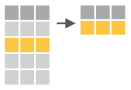
epcdatais currently in wide format, with each variable as its own column. We want to pivot it to long format so that each row is an observation of a single indicator. Thedplyrpackage is the ‘swiss army knife’ (or ‘plyers’) for data wrangling, along with its close cousintidyr. Let’s look at some basic operations: filtering, selecting, and pivoting. Be sure to reference Posit Cheatsheets like Data tidying with tidyr :: Cheatsheet and Data transformation with dplyr :: Cheatsheet.Select

Reduce columns to only those specifiedepcdata |> dplyr::select( station = epchc_station, SampleTime, `Total Nitrogen (mg/L)` = tn, `Chlorophyll-a (ug/L)` = chla, `Secchi depth (m)` = sd_m )Pivot
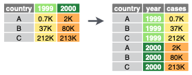
Transform the data from wide to long formatepcdata |> tidyr::pivot_longer( names_to = "indicator", values_to = "value", `Total Nitrogen (mg/L)`:`Secchi depth (m)` )Filter
Reduce rows based on condition(s) that evaluate logically (i.e. True or False)epcdata |> dplyr::filter(station == 8)
Applying the above concepts, create a new folder app-wq for the water quality app and create the R file app.R inside the folder with the following contents:
# * load libraries ----
library(tidyverse)
library(plotly)
library(tbeptools)

# * prep data ----
d <- epcdata |>
  select(
    station                 = epchc_station,
    SampleTime,
    `Total Nitrogen (mg/L)` = tn,
    `Chlorophyll-a (ug/L)`  = chla,
    `Secchi depth (m)`      = sd_m) |>
  pivot_longer(
    names_to  = "indicator",
    values_to = "value",
    `Total Nitrogen (mg/L)`:`Secchi depth (m)`)
d
# A tibble: 85,503 × 4
station SampleTime indicator value
<dbl> <dttm> <chr> <dbl>
1 6 2024-12-09 09:27:00 Total Nitrogen (mg/L) 0.246
2 6 2024-12-09 09:27:00 Chlorophyll-a (ug/L) 6.6
3 6 2024-12-09 09:27:00 Secchi depth (m) 1.9
4 7 2024-12-09 09:38:00 Total Nitrogen (mg/L) 0.352
5 7 2024-12-09 09:38:00 Chlorophyll-a (ug/L) 3.9
6 7 2024-12-09 09:38:00 Secchi depth (m) 2.8
7 8 2024-12-09 11:42:00 Total Nitrogen (mg/L) 0.315
8 8 2024-12-09 11:42:00 Chlorophyll-a (ug/L) 5.3
9 8 2024-12-09 11:42:00 Secchi depth (m) NaN
10 9 2024-12-09 11:02:00 Total Nitrogen (mg/L) 0.18
# ℹ 85,493 more rowsWe additionally need to prepare data for the following elements:
- Stations
List of unique station numbers for selecting from a drop-down menu. - Indicators
List of unique indicators for selecting from a drop-down menu.
# * data for select ----
stations   <- unique(d$station)
indicators <- unique(d$indicator)

stations
[1] 6 7 8 9 11 13 14 16 19 23 24 25 28 32 33 36 38 40 41 44 46 47 50 51 52
[26] 55 60 63 64 65 66 67 68 70 71 73 80 81 82 84 90 91 92 93 95indicators[1] "Total Nitrogen (mg/L)" "Chlorophyll-a (ug/L)" "Secchi depth (m)" 2.5.2 Add User Interface
Let’s add dropdown menus for station and indicator selection and a placeholder for the plotly output. These outputs are htmlwidgets that allow additional interactivity. They will also be updated based on user input.
#  ui.R ----
ui <- fluidPage(

  # * layout ----
  wellPanel(
    h2("Water Quality"),

    # * input widgets ----
    selectInput("sel_sta", "Station",   choices = stations),
    selectInput("sel_ind", "Indicator", choices = indicators),

    # * output htmlwidgets ----
    plotlyOutput("tsplot")
  )

)
Notice that shiny::fluidPage() and shiny::wellPanel() functions are used for the layout. For more details, check out Shiny - Application layout guide. For even more advanced layout options, checkout shinydashboard and bslib R packages.
Notice that plotly::plotlyOutput() is used to layout the htmlwidget. We need these components because we’ll be updating them interactively based on user input with server-side functions.
2.5.3 Add Server functions
Let’s add renderPlotly() to update the time series plot based on user inputs. The renderPlotly() function takes a plotly interactive plot object. We can use the plotly::ggplotly() function to take a static ggplot2 plot object and make it an interactive plotly object. Using ggplot2 allows us to take advantage of the Grammar of Graphics principles to render plots using a layered approach (see cheatsheet, summary or book).
The get_data() component allows us to generate a data frame reactive to user inputs and available for use across multiple server-side functions (although here we only use one). For more, see Shiny - Use reactive expressions.
#  server.R ----
server <- function(input, output, session) {

  # * get_data(): reactive to inputs ----
  get_data <- reactive({
    d |>
      filter(
        station   == input$sel_sta,
        indicator == input$sel_ind)
  })

  # * tsplot: time series plot ----
  output$tsplot <- renderPlotly({
    g <- ggplot(
      get_data(),
      aes(
        x = SampleTime,
        y = value) ) +
      geom_line() +
      labs(y = input$sel_ind)
    ggplotly(g)
  })
}
2.5.4 Final app
Now with all the pieces, your app should work as intended. Try running it by placing shinyApp(ui, server) at the bottom of your file and sourcing the entire script. The finished product should look like this:
# Goal: Create an app to show a time series by station and indicator

# global.R ----

# * load libraries ----
library(tidyverse)
library(plotly)
library(tbeptools)

# * prep data ----
d <- epcdata |>
  select(
    station                 = epchc_station,
    SampleTime,
    lat                     = Latitude,
    lon                     = Longitude,
    `Total Nitrogen (mg/L)` = tn,
    `Chlorophyll-a (ug/L)`  = chla,
    `Secchi depth (m)`      = sd_m) |>
  pivot_longer(
    names_to  = "indicator",
    values_to = "value",
    `Total Nitrogen (mg/L)`:`Secchi depth (m)`)

# * data for select ----
stations   <- unique(d$station)
indicators <- unique(d$indicator)

#  ui.R ----
ui <- fluidPage(
  wellPanel(
    h2("Water Quality"),
    selectInput("sel_sta", "Station",   choices = stations),
    selectInput("sel_ind", "Indicator", choices = indicators),
    plotlyOutput("tsplot")
  )
)

#  server.R ----
server <- function(input, output, session) {

  # * get_data(): reactive to inputs ----
  get_data <- reactive({
    d |>
      filter(
        station   == input$sel_sta,
        indicator == input$sel_ind)
  })

  # * tsplot: time series plot ----
  output$tsplot <- renderPlotly({
    g <- ggplot(
      get_data(),
      aes(
        x = SampleTime,
        y = value) ) +
      geom_line() +
      labs(y = input$sel_ind)
    ggplotly(g)
  })

}

# run ----
shinyApp(ui, server)
2.6 A dirty trick…
Much has changed in the programming world over the last few years. As you might expect, there are generative AI tools to help build and develop Shiny apps. The Shiny Assistant from Posit can be used in this capacity.
It works like any other generative AI tool, except it’s trained specifically to support Shiny development AND has a built in feature for rendering generated apps directly in the browser. Here’s a prompt that shows how you could build an app similar to the one above that shows the tool the general structure of your data (i.e., str(epcdata)).
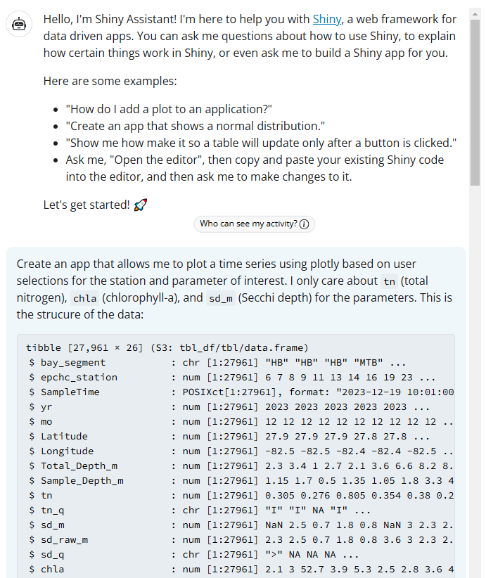
This is the app that it gave me, after substituting my input data.
Show Code
library(shiny)
library(bslib)
library(plotly)
library(dplyr)
library(lubridate)
library(tbeptools)

# Create labels for parameters
param_labels <- c(
  "tn" = "Total Nitrogen",
  "chla" = "Chlorophyll-a",
  "sd_m" = "Secchi Depth (m)"
)

ui <- page_sidebar(
  title = "Time Series Explorer",
  sidebar = sidebar(
    selectInput("station", "Select Station:",
                choices = sort(unique(epcdata$epchc_station))
    ),
    selectInput("parameter", "Select Parameter:",
                choices = setNames(names(param_labels), param_labels)
    ),
    hr(),
    helpText("Select a station and parameter to view the time series plot.")
  ),
  card(
    card_header("Time Series Plot"),
    plotlyOutput("tsplot")
  )
)

server <- function(input, output, session) {

  # Create the plot
  output$tsplot <- renderPlotly({
    req(input$station, input$parameter)

    # Filter data
    plot_data <- epcdata %>%
      filter(epchc_station == input$station) %>%
      arrange(SampleTime)

    # Create plot
    p <- plot_ly(data = plot_data,
                 x = ~SampleTime,
                 y = as.formula(paste0("~", input$parameter)),
                 type = 'scatter',
                 mode = 'lines+markers',
                 name = param_labels[input$parameter]
    ) %>%
      layout(
        title = paste("Time Series for Station", input$station),
        xaxis = list(title = "Date"),
        yaxis = list(title = param_labels[input$parameter])
      )

    p
  })
}

shinyApp(ui, server)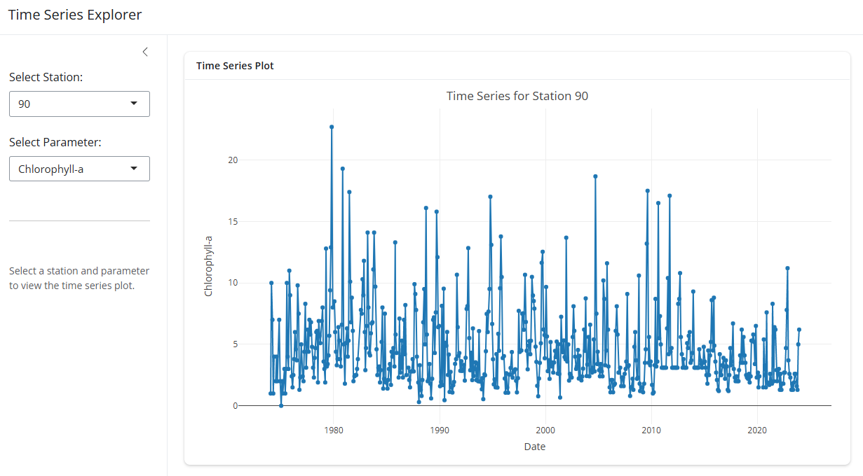
A word of caution… just because you can doesn’t mean you should. Don’t use this as a crutch to a deeper understanding of Shiny. It’s a useful learning and troubleshooting tool, but it shouldn’t replace the conventional learning process to build personal knowledge of the tools.
2.7 Next steps
In this lesson, we learned about building a simple Shiny app and built on these principles to develop a more complex application. We also learned how to troubleshoot applications using the browser() function. In the next module, we’ll talk about deploying Shiny apps and discuss common challenges developing and using Shiny apps in the wild.